Best rebrands of all time (and one of the worst)

Published: July 18, 2022
Why do businesses rebrand?
Never be afraid to start something new.
In the world of business, rebranding has become a common strategy for various reasons. Whether it’s attracting a new market, adapting to changing times, and more. As a logo design company Melbourne, we understand the importance of a well-crafted brand identity.
There are several reasons why a business would consider a rebrand and it doesn’t necessarily mean the business has been unsuccessful.
The top reasons a business may look to rebrand is:
- Attracting a new market or demographic: This could mean expanding internationally, increasing prices, or introducing a new product under an existing umbrella of services.
- New ownership: Most new owners want to embed their goals and values into their new business or purposefully let their customers know there has been a change of ownership to instil consumer confidence.
- Changing with the times: If a business has been around for 20+ years and hasn’t undergone a rebrand in over two decades, they’re most likely using an outdated design and tone of voice. Making a brand fit within the modern market is so important.
- Negative reputation or sales: In the worst-case scenario, a business is underperforming with an increase in negative feedback or decrease in sales. This doesn’t mean the business needs to close its doors, instead a simple rebrand can do the trick to get their customer base excited again.
Let’s look at four of the best rebrands of all time.
1. Airbnb
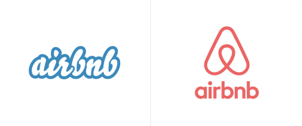
This is a great example of a company responding to a changing market through international growth.
Firstly, they needed a logo design that anyone could draw and that could reach beyond the English-speaking world. The new logo is more than just a continuous line. If you look carefully, you can see both a location pin and heart symbol. You can also see a very clever monogram with a capital ‘A’ and two lowercase ‘b’ meeting in the middle between the ampersand ‘&’ symbol.
Secondly, they needed to give their brand a more relatable and memorable personality. Like most online marketplaces, they spent a lot of time building their technology and establishing themselves as a reliable and easy to use service. Once they gained momentum, they realised their mission and differentiating point from competition was to create the feeling of a ‘home’ for its customers.
Airbnb’s rebrand allowed them to expand into the global market whilst simultaneously staying ‘local’.
2. Dunkin’ Donuts
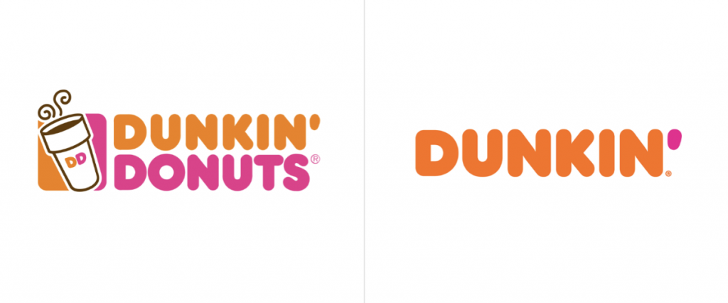
Dunkin’, formally Dunkin’ Donuts, was established in 1948 as a small donut and coffee shop in Massachusetts. To put it into perspective, donuts back then were served for 5c each and a cup of coffee was only 10c. Dunkin’s rebrand is an example of a company staying up to date with its modern audience.
By dropping the donuts and enhancing the coffee, Dunkin’ have successfully renamed themselves to something that can easily fit on a customer’s coffee cup. But who’s idea was this?… Yours. Dunkin’s customers are responsible for the rebrand themselves and were the creators of the affectionately named coffee provider. Just as Australian’s nicknamed McDonald’s ‘Maccas’, Dunkin’ had already become a personality in itself and was brought to life by good company decision making.
3. Uber
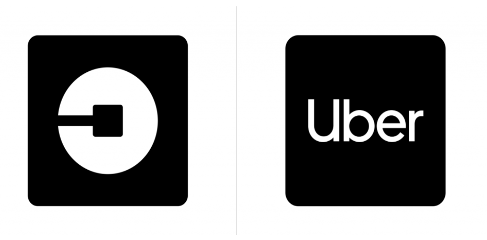
You’re probably looking at this logo design rebrand and thinking ‘is this even considered a logo?’. Well, that’s exactly what Uber wants you to think about.
After a supposedly ‘toxic’ leadership change, Uber had an opportunity to rethink its values and mission. Their previous logo just wasn’t as memorable as other iconic brands such as Nike, Starbucks, Apple, or Mercedes. With promising international growth and a simultaneous challenge with trusted taxi companies, Uber had a goal of becoming more than just a rideshare app and expanding into a global mobility platform.
Since this rebrand, Uber has also achieved uniformity amongst all their services with similar simplistic designs used with Uber Eats and Uber Freight. This is a good example where the name is more recognisable than the logo, so why not use the name and ditch the logo.
4. Menulog
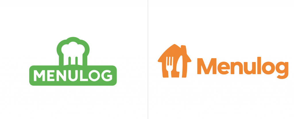
This one is for our Aussie & New Zealand audience, although we’re sure anyone can appreciate the daunting concept of changing the entire brand’s colour scheme.
After a company merger between JustEat and Takeaway.com, as well as an ambitious goal of bringing food delivery into more regional areas, Menulog’s solution was an updated brand strategy. Fighting for the runner-up position in food delivery, Menulog had Deliveroo on their doorstep who had also undergone a recent rebrand.
What’s interesting here is the colour representation. Green has always been associated with freshness and health. This seems like a concept that would matter to Menulog’s customers especially since we’ve all experienced the dreaded late and cold meal delivery. However, orange is a well-known colour to stimulate your appetite. So, even though you’ve experienced a late delivery once or twice, you’re more likely to order through their app now that the colour is orange!
Now for our nominated rebranding fail.
Now this one is a controversial opinion that we know will divide our readers.
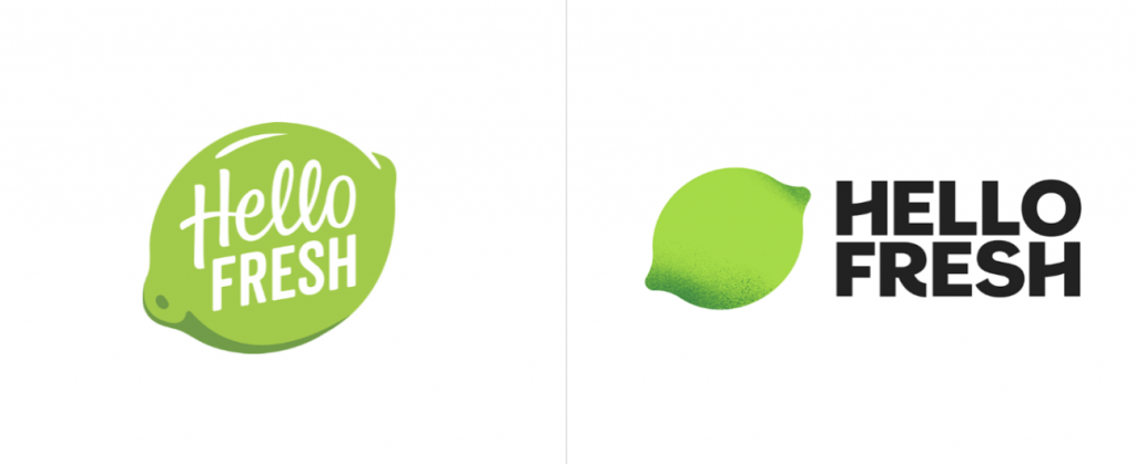
With a very competitive ‘meal kit’ market, HelloFresh needed to find a way to stand out from their competition and increase consumer confidence in their product. The challenge for this company was to assert themselves as the leading choice amongst the sea of meal delivery options.
While we can certainly appreciate the bold, simplified typography and the pop of colour created by the contrast between the bright lime and black font, there’s something a little ‘off’ about the fruit… As many customers and designers have rightly pointed out, the spotted dark end on the lime seems to closely resemble mould.
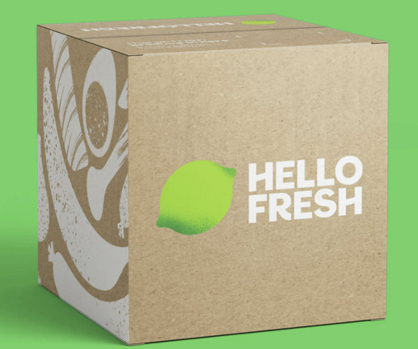
This unfortunate oversight, which was an innocent attempt at shadowing, has got HelloFresh trending for all the wrong reasons. Their attempt to promote freshness with an ironically un-fresh logo is a great example of rebranding gone wrong.
Articles.
April 2024
Common Branding Mistakes to Avoid in 2024
Whether you’ve just launched your business or have owned one for years, one small...
April 2024
Why Is Branding Important For Business?
Picture this: You walk down a street and see two cafes on either end....
April 2024
What is Branding?
Businesses today are not selling products; they’re selling experience. And how do they do...