Logo trends for 2023
Published: July 19, 2022
What makes a great logo design? Is it the logo colour?… Typography?… Symbols? You’ve probably heard the phrase ‘beauty is in the eye of the beholder’, and whilst that is true, human history is filled with a cycle of design trends.
Without triggering horrible memories from your high-school history class, I just want to point out that humans have been using graphic design since 38,000 BCE – a symbol of our cognitive revolution through cave drawings and abstract thought. Since then, we’ve seen architectural movements such as the classical, gothic, renaissance, neo-classical, art-deco, modernist, and postmodernist styles. The designs of these eras have usually reflected both human advancement in construction and technology as well as the cultural influence of the time.
Now this doesn’t mean your logo design is going to be the catalyst for a sociological shift in behaviour, but it does highlight what someone thought was ‘beautiful’ in 1964 may not be considered beautiful in 2023. I think we can all attest to this after witnessing orange carpet become a popular interior design in the 1960s.
As we are well and truly emersed in the digital world, trying to keep up with the fast-moving ideas on social media, what are the next big logo trends?
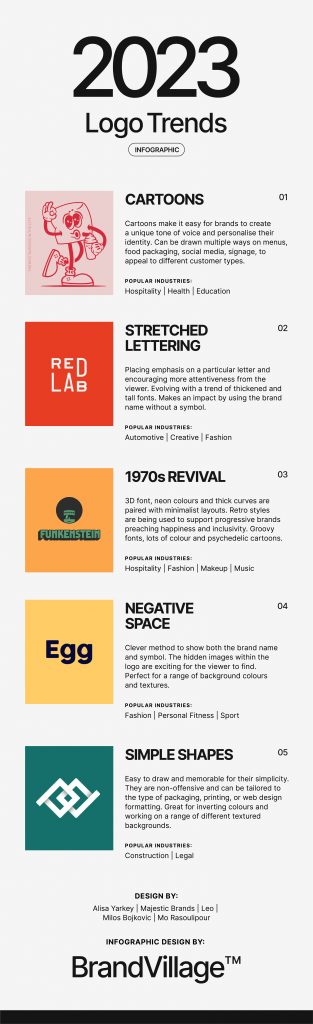
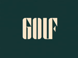
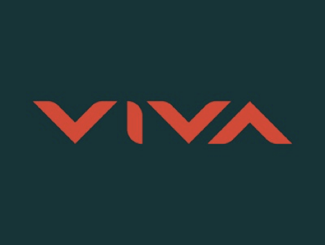
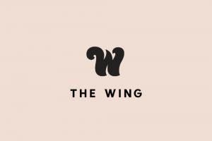
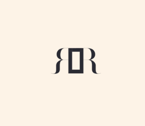
Negative Space.
A logo within a logo. Negative space logos use the background colour and space within a letter or image to create a whole new logo within itself. This is a clever method to showcase both the name of the brand and logo symbol simultaneously. The hidden images within the logo are exciting for the viewer to find and show that the designer was able to meld two ideas together at the same time.
Creative typography plays a big role to pull off this trend effectively with most designers opting to use a thicker font to create a larger space for their hidden logo. This style is perfect for a range of backgrounds and textures, and can be inverted as needed.
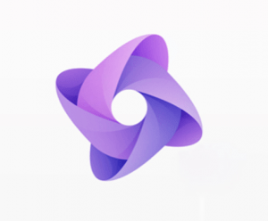
Gradients.
Gradient style logo design blends the colours so that each shade effortlessly evolves into the next. This style is very common with popular brands such as Instagram, Tinder, and Messenger all of which have apps that need to stand out on our phones. One downside of this style is that printing can be tricky with multiple shades of colours. However, this type of logo can look awesome for an online business, particularly those in either the creative or tech industries.
Coupled with a 3D style, these designs can look futuristic and innovative, something that resonates with software engineers. Otherwise the inclusivity from a multi-coloured design can appeal to a range of people, which is important for social media platforms.
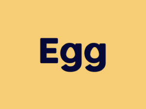
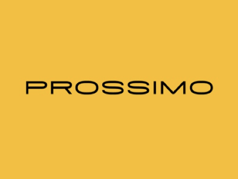
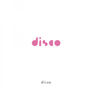
Stretched Lettering.
More frequently we are seeing designers play around with typography to create a stretched look for their logo design. To either place emphasis on a particular letter or encourage the viewer to spend longer interpreting the logo, this technique seems to have taken hold of the graphic design world. What we haven’t mentioned in this list is also an evolving trend of thickened font and tall logos. We’re excited to see graphic designers break the rules of traditional typography and make an impact with their logos.
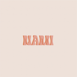
1970s Revival.
Coming back into fashion, along with the dreaded flared jeans, is 1970s logo design. Groovy fonts, lots of colour and psychedelic cartoons are making their way into a range of industries. With climate change and gender equality activism increasing, these retro styles are being used to support progressive brands preaching happiness and inclusivity.
Similar to the stretched lettering trend above, designers are finding more freedom through their typography to experiment with fun logos. 3D font, neon colours and thick curves are paired with minimalist layouts placing most of the impact on the retro typography.
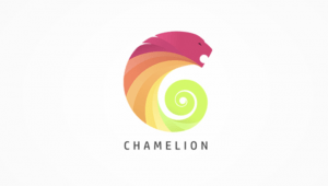
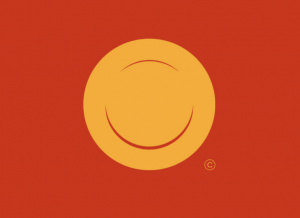
Simple Shapes.
A picture is worth a thousand words. This is particularly true for these minimalist logos that rely on basic shapes to bring an impact to the design. Easy to draw and memorable for their simplicity, these layouts are re-emerging into the construction, consulting, fashion, and financial industries. They are non-offensive and can be tailored to the type of packaging, printing, or web design formatting. Great for inverting colours and working on a range of different textured backgrounds.
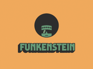
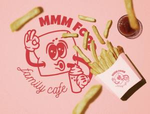
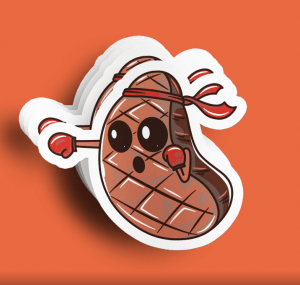
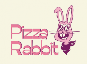
Cartoons.
Popular in the hospitality place, due to the colour and family friendly nature, cartoons are coming back into logo design. Making a comeback in conjunction with retro designs, cartoons make it easy for brands to create a unique tone of voice and personalise their identity.
The advantage of cartoons is the endless ways they can drawn on menus, food packaging, social media, signage, to appeal to different customer types. Ultimately, the hospitality industry wants to attract all demographics and age groups, so cartoons are a suitable option to achieve this. Just like the toucan from the fruit loops commercial or Ronald McDonald, cartoons have helped us remember famous brands by giving them a friendly face.
Conclusion.
Like we said at the beginning, beauty is in the eye of the beholder, but there are certainly some beholders worth listening to. At the end of the day this isn’t something that a business owner should need to worry about unless they have a side hustle in graphic design. Logo designers are available to walk you through this process, get to know your business and help you identify what you’re trying to achieve with your brand.
Our expert team of logo designers in Melbourne spent many years learning and trialling all the design trends so you don’t have to. Offering bespoke logo packages available to a range of business types, we are happy to take the burden off your shoulders and help you navigate the complex world of graphic design.
Articles.
April 2024
What is Environmental Graphic Design?
Did you ever visit a website or receive a package and get lost in...
April 2024
What is Bleed in Graphic Design?
Ever notice those unwanted white borders and uneven looks on brochures or business cards?...
April 2024
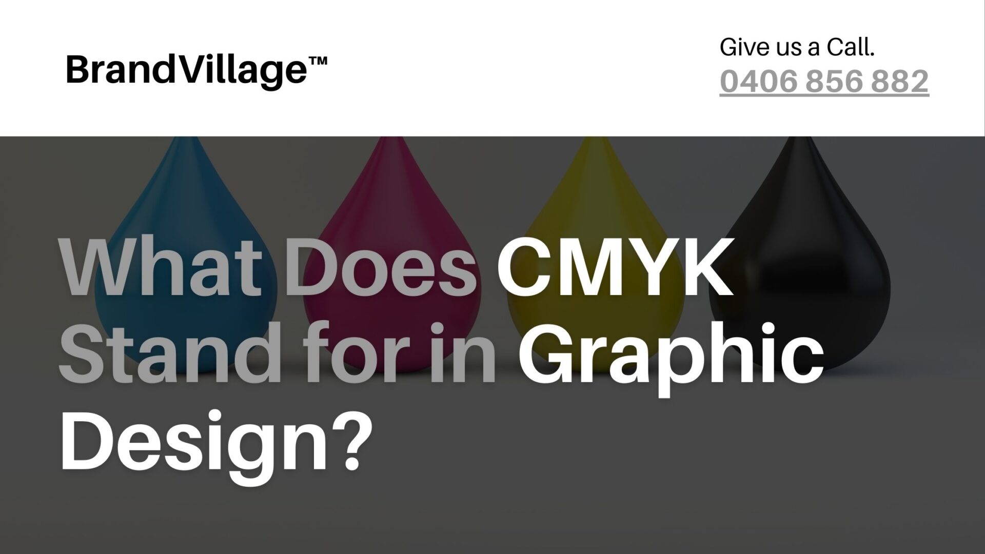
What Does CMYK Stand for in Graphic Design?
We all have been taught the concept of three primary colours- red, yellow and...