15 Best Logos in the World & Their Unforgettable Stories
Published: May 18, 2023
A “logo” usually articulates all the marks that symbolise your business.
As a founder, I often hear this small voice that whispers in their minds when startups or businesses come to us for a logo design that do they need a logo.
However, we make them realise the essence of having a logo and how it helps them:
- Differentiate your business from competitors.
- Creates a strong impression.
- Grabs the user’s attention.
- It makes your brand memorable.
- Nurtures your brand loyalty.
Agreed that creating a killer brand image demands numerous elements, such as colour patterns, notions, slogans, customer service, and graphics. Still, before you get into all of these, in the end, it’s about the logo.
While many businesses treat their logos as an afterthought, the world’s top logos have resulted from careful consideration and intentionality, reflecting a deeper meaning and purpose, which will be discussed below.
So if you’re looking for an enthusiastic team of creative logo designers in Australia who enormously care for attention to detail and love what they do, feel free to connect with (an award-winning logo design company Melbourne) – BrandVillage.
15 Logo Legends That Nailed Their Visual Identity
The best logos are the ones that become synonymous with their brand and are instantly recognisable.
They have an impact that is beyond just their design, and their story inspires many others who aspire to create a timeless visual identity.
These logos did not become legends overnight but are the result of consistency and determination to roll with the times, adapting to changes in fashion and technology.
#1 Nike
- The iconic Nike logo is a testament to the power of simplicity. Its swoosh design, created by a Portland State University student named Carolyn Davidson in 1971, is a prime example of how the simplest ideas can often be the most effective.
- Surprisingly, Carolyn was only paid a meagre $35 for her work.
- Despite initial reservations from founder and CEO Phillip Knight, who reportedly said, “I don’t love it, but it will grow on me,” the logo proved to be a success.
- The inspiration for the logo came from the wings of the Greek goddess who embodied victory.
- This was a fitting choice for a company that had clarity of their wants and a belief system that centres around helping athletes reach their potential.
- Davidson also wanted to convey motion in the design, which explains the logo’s dynamic and forward-moving appearance.
- In 1983, Phillip Knight’s prediction about the logo’s success came true.
- He rewarded Carolyn Davidson with a gold diamond ring with the Nike symbol embedded in it and an envelope containing Nike 500 shares.
#2 Coca-Cola
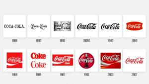
- In 1886, Coca-Cola (the most popular carbonated drink) came up with a pretty slick logo, thanks to Frank Mason Robinson.
- It was black and white, but it was still pretty darn famous.
- Over the years, the emblem evolved a bit, but they kept the fancy script lettering that everyone loved.
- Fast forward to 1958-2016, Coca-Cola Logo was made official – they were all about that red disc design. And the people rejoiced!
#3 Apple
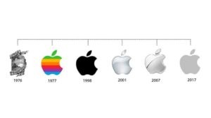
- The original Apple Logo was designed by one of its co-founders, Ron Wayne. It was a complex and hard-to-decipher design that featured Sir Isaac Newton sitting under an apple tree.
- But when Steve Jobs took over the company, he ditched the original design and simplified the logo to a clean, modern apple with a bite taken out of it.
- This redesign perfectly reflects Apple’s brand values, which emphasize simplicity, innovation, and recognizability.
- Back in 1977-1998, the logo was a burst of colours, a rainbow that symbolized Apple’s focus on cutting-edge technology and the vibrant world of colour displays.
- However, over time, Apple’s design philosophy evolved.
- They became more focused on minimalism and elegance in design. Hence, they transitioned to a sleek and metallic logo.
- This minimalistic logo represents this brand that eliminates gradients and improves the interface’s readability.
#4 McDonald’s
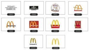
- Do you know that iconic McDonald’s logo with golden arches?
- Well, those arches were part of some fast food chain design.
- Back in 1940, the McDonald’s brothers were expanding their small restaurant, and they wanted a spacious and visually appealing building.
- So they hired a famous architect named Stanley Clark Meston to help them out.
- He took one of the brothers’ drawings and turned it into the famous golden arches that we know and love today.
- You might wonder why the logo is just an “M” (which was extended by Jim Schindler) when the original design had two arches.
- Well, it’s a letter mark logo, meaning it’s made up of letters instead of an image.
- The “M” stands for McDonald’s, of course, and it’s a simple but memorable design that’s instantly recognisable worldwide.
#5 Google
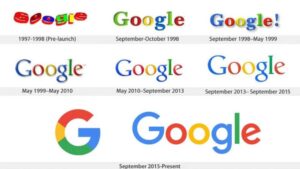
- Back in 1998, Google cooked up their iconic logo using a basic font (to indicate the company’s name).
- Google Logo stayed the same for over a decade until they switched the colours in 2009 (by Ruth Kedar).
- They also made some minor tweaks to the letter spacing in 2014.
- But in 2015, they really went for it and unveiled a brand-spankin’ new logo with a fresh, bold typeface that made the old one look like yesterday’s news.
#6 BMW
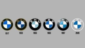
- BMW logo – the badge features two circles, with a check pattern of white and blue in the inner circle and the bold letters “BMW” on a transparent background in the outer circle. It’s simple, it’s sleek, and it’s instantly recognisable.
- While other car companies have changed their logos (over the years), BMW has stayed true to their classic roundel.
- In fact, BMW refers to their logo as the “BMW roundel.”
- BMW keeps its typography classy with a simple sans-serif font in all caps.
- Even if you’re not a car enthusiast, you can appreciate the sleek and recognisable design of the BMW logo.
#7 FedEx
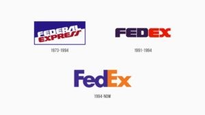
- Can you believe that a simple blue wordmark in a blue pattern from 1973 would eventually become the iconic FedEx logo we know today?
- Who knew a minor tweak, like adding a white arrow between the E and X (with a blend of univers 67) in 1994 (by Lindon Leader), would make such a huge difference? It shows that even the most minor changes can lead to great things.
- Over the years, FedEx has gone through various colour and style changes. But it’s that little white arrow that really makes the logo stand out. It symbolises the company’s dedication to delivering packages quickly and efficiently.
#8 IBM
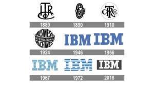
- Also dubbed Big Blue, IBM (International Business Machines Corporation) is known for being one of the most iconic logos in the world.
- Designed by Paul Rand in 1972, this logo stands tall as shining armour, which has stayed the same since its inception.
- With total 8 horizontal lines and letters penned with the touch of serifs and City medium font, these letters signify authority, confidence, and a sense of minimalism. And at the same time, the stripes represent speed and dynamism.
- What sets the IBM logo apart is that this company was first among other prominent companies between 1956-1967 whose logo was based on stripes that artfully conveyed their lightning-quick services.
#9 Adidas
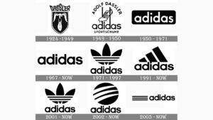
- Did you know that Adolf Dasslerr started this immense sports brand in his mother’s laundry room, which sooner, in 1947 named Adidas?
- In 1924 the original logo had the second name of the co-founders with the motive of showing how light-weight the show was.
- In 1949 the company split into two separate firms where the new logo had an extended D which was holding the shoe.
- Seventy-eight years down the line Adidas logo contained the trefoil, which conveyed the company’s commitment to variety.
- And the 3 stripes added more power to the logo and conveyed the challenges and goals people needed to conquer.
#10 Pepsi
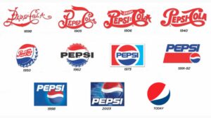
- Pepsi, this brand, had become a colossal name in the beverage realm.
- Even though its logo has always been simple to comprehend but throughout its span of 125 years, Pepsi has gone through 13 iterations, where Caleb Bradham, the brilliant man behind Pepsi, designed the first one.
- And the second major redesign was done in 2008 in a circular shape by an eccentric person named Peter Arnell.
- Moreover, if we talk about the logo’s meaning, then it conveys a more profound message that evokes feelings of pride and illustrates the refreshing nature of this drink.
- And as far as the logo’s symbol is concerned, some people believe it’s a smiling face, while others say it represents the earth and is a sort of Da Vince Code that contains relativity theory, Feng Shui, and magnetic fields.
#11 Subway
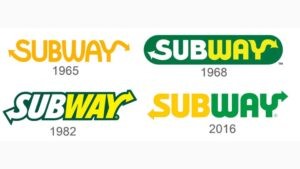
- Subway was founded by a 17-year-old guy named Fred DeLuca. Both Subway and its logo had a slow start in the beginning, but eventually, in 1982, they had 300 restaurants across the nation.
- The logo of the Subway, which we see today across our way, was first designed in 1968 and was further improvised till 2016.
- After a gap of 51 years trying various fonts and designs, Subway came up with a more simplified design in 2016 where the left side of the logo was solid yellow with an arrow in S and the right side with solid green with an arrow in Y.
- Combined with a sens-serif typeface and utilizing the white space, the arrows on the left and right side of the logo conveyed the entry and exit, which meant you could have the food along the way.
#12 Toblerone
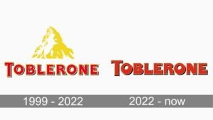
- If you closely examine Toblerone’s logo, you’ll witness that it isn’t just a mountain but a bear hidden in its white silhouette whose shape is given by negative space. Like Pepsi,
- Toblerone is one of the distinguished canons of brands whose logo also has a hidden meaning. What?
- Well, the present emblem of Toblerone has a light brown inscription that reminds the colour of milk and chocolate.
- Now if we talk about what precisely this logo conveys, is that the bear which is covered with snow valleys and shaped by mountains, is Bern’s national symbol. And the most crucial part of the logo is the triangle shape which aligns with the Matterhorn (the mountain Alps) situated near Bern.
#13 NASA
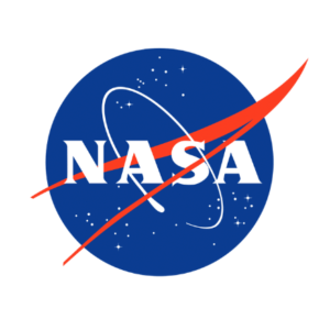
NASA, also known as the National Aeronautics and Space Administration’s logo, was designed in 1959 (by James Modarelli) with the name given as meatball. This logo encapsulated all the elements and ingredients of an American Space program, including
- A blue circle painted with stars.
- A red swoosh signified an airline wing.
- And a spacecraft circling around the wing.
#14 Instagram
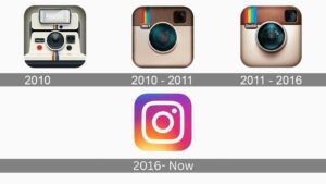
- Instagram’s logo was designed by Kevin Systrom- one of the co-founders, in 2010.
- The first logo in 2010 was displayed as a front shot of a Polaroid camera with a small Instagram font inscribed on it.
- Within a year between 2010-2011, the Instagram logo woned many hearts, which then required a professional design. This professional design was inspired by a bell and howell camera, which resulted in a beige and brown look.
- Moving forward, the year 2016 saw a revolutionary Instagram logo where the designers had combined the elements of the previous logo design, which included vibrant colours, a polaroid, and a rounded square shape.
#15 GAP
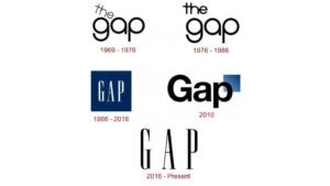
- GAP is the third largest clothing retailer in the international markets.
- There’s one fascinating story behind the GAP logo. Every brand, after some point in time, changes its logo design with a motive to give it a unique touch and improve sales. And that’s exactly what GAP did in 2010, which turned out to be a failure due to the lettering of the word GAP and a small blue square in the upper right corner.
- In 2016, right after ten years, the company again redesigned the 1986 logo into a monochrome combination with white background and the fonts in black with space between them that adds a sophisticated and light feeling.
- This redesign conveys the brand’s message, which articulates the generation.
Common Factor That Makes Logos A Hit
A logo isn’t just a simple design element. Think of it as a spokesperson that can communicate with the audience just as effectively as I do with my clients. But not all logos are designed equally. So what separates the good from the great?
Therefore working with numerous businesses and startups and analysing the world’s most recognisable brands, my team and I have identified five key factors that make a logo hit.
Simplicity
- Simplicity is one of the most crucial factors in making a logo easily recognised and memorised.
- Good emblems often include something unique or spontaneous without being too complex.
- Nike’s swoosh is an ideal example.
Scalability
- When a logo is designed, scalability is a fundamental factor a designer can’t overlook.
- After all, your logo will be featured on various promotional materials such as billboards, business cards, pamphlets, posters, and social media posts.
- That is why it’s crucial to ensure your logo can quickly adapt to different sizes without losing its essence.
Memorable
- Memorability is a key element of effective logo design.
- A too-simple logo may be forgettable. In contrast, one that is too complex may be confusing.
- Therefore, a logo designer must balance simplicity and appropriateness to make a logo more memorable. For example, the Gambit Group, where I interlocked two G’s.
Strategically Use of Colours
- Using colour strategically is a fascinating subject that delves deep into human psychology and can significantly enhance the mastery of a logo designer.
Font
- While I’ve said that simplicity is a key to designing a logo, that doesn’t mean you can have fun with your text (font).
- Big tech giants like Microsoft, Nokia and Google are sticking to using just their names in their logos, but they’re still able to make a lasting impact on people all around the globe.
- How, you ask? They play around with the fonts to give their logos personality and charisma.
- Just a little creativity and a killer font can do the trick.
Conclusion
While a great logo alone won’t guarantee a prosperous business, a well-crafted and visually appealing design, along with the factors, can help you establish a strong presence in a crowded industry. Your logo serves as the face of your brand, and a memorable and distinctive one can make your company stand out in a sea of competitors.
But let’s be honest – designing the perfect logo is no easy task. It requires technical know-how, an understanding of branding, and an eye for design. And I’m not patronising you to hire me as I’m only the one, but because our design agency in Melbourne has been delivering exceptional logo design and graphic design services in Melbourne, Australia for over five years.
We know this nation’s culture and traditions inside and out, and we use that knowledge to help your brand/business find its ideal visual identity.
All you have to do is request a free consultation today and see what expertise we bring.
Articles.

July 2024
What is a Website Hosting Service?
Did you know that 88% of web users abandon sites due to poor performance? Also,...

July 2024
What is Branding in Marketing?
Branding sets a business apart, influencing: 34.6% of shoppers to repurchase 89% buy from...

July 2024
7 Commonly Used Branding Strategy
In Melbourne’s vibrant and ever-evolving market, a strong brand is no longer an option;...