A Perfect Guide on Logo Colors: Checkout Different Combinations
Published: May 9, 2023
We, as a human, love colour. Jump back to when we were all in Kindergarten, and we wanted to get the biggest box of crayons or the latest collection of colour pencils.
That fascination among us hasn’t gone yet.
Why? Because colour evokes a certain sense of emotions, speaks its message, and adds lustre to everyday things.
Now if we speak about colour in the context of logo design, then picking up the right colour can highlight the power of your business and draws potential clients.
In contrast, selecting the false combination will have adverse effects.
You may assume why this small element in the logo design process has a crucial role.
A colour shapes your brand’s values and personality through a visual connection.
Apart from being aesthetic, your logo’s colour connects your target audience with your brand on an in-depth psychological level.
Even the research conducted by Lauren Labrecque proves that some colours do have a psychological impact on consumers.
That is why being an owner of “Award Winning logo design agency Melbourne – Brandvillage”, I (Kate) need to know the actual meaning of colours. Knowing the purpose of these colours will help drive my client’s business to new heights.
Working for over 5+ years on colour contrast logo designs and other elements, I have established my expertise in colour psychology, which helped me scale up my designing game. Now that you’re new to these colour bars and their importance in logo design, I have covered it for you.
Understanding The Color Psychology
There are specific colours which stir certain emotions and articulate different concepts. Even researchers at the University of Missouri have found that particular colour used by a brand in their logo has a significant impact on how the consumer will perceive that logo along with the brand as a whole.
Colours have a way of speaking with their audience through a subconscious level like:
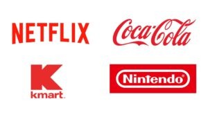
Red
- Red symbolises hunger, love, passion, excitement, anger, and danger.
- This global symbol is usually an attractive and energetic colour which is popular among men and extroverts.
- Brands in the health, food, and entertainment sectors prefer using red in their logo design because this royal colour helps attract consumers, pumps emotions, and augments energy levels.
- Netflix, Coca-Cola, K-mart, and Nintendo are the perfect example of how they have placed red in their logo along with minimal font, making them stand out.
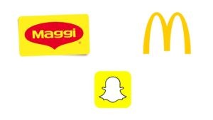
Yellow
- Yellow signifies warmness, innovation, happiness, optimism, and caution.
- This sunshine colour invokes feelings of cheerfulness and relaxation among people.
- Brands usually use this colour to highlight the essential aspects of their logo.
- Maggi, MacDonalds, and Snapchat are perfect examples.
Blue
- Blue represents success, confidence, authority, and a sense of loyalty and trust.
- As an audience, you might have felt refreshed and soothed while seeing the blue colour in a logo because that is what it does.
- Many industrial sectors like pharma, software, corporate, and finance merge blue in their logo design to create a sense of security and professionalism.
- Take IBM and Pfizer, for example.

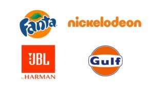
Orange
- Being Yellow’s playful cousin, orange represents change, excitement, prosperity, and playfulness and also brings out the sentiments of approachability and enthusiasm.
- Orange colour has something in it which evokes different emotions in different sectors; for instance, in one, it stimulates appetite, while in others energy and creativity.
- Fanta, Nickelodeon, JBL, and Gulf are perfect examples that resonate with each line.
7 Tips on How to Choose the Right Colors for Your Brand Identity
With endless options out there, choosing the right colour for your logo design can be a daunting task, but with these seven tips, you can narrow down your options and pick the right colour that depicts your brand message.
#1 Specify Your Brand’s Identity
The colours you choose reflect your brand’s identity, so it’s crucial to align your business values, what sets you apart, and the message you want to convey to your target audience with your colour palette.
#2 Explore The Meanings Of Colour
After identifying the psychology behind the colours and personality of your brand, it’s crucial to explore each colour’s meaning and check which colour aligns with your business goals and vision.
#3 Look Up At Your Competitors
Before crafting a colour for your brand, look up at your competitors, check out which colour palettes works well for them and, based on that research, how you can make your own colour scheme that distinguishes your brand from competitors.
#4 Select Your Primary Colour
Make sure you heedfully select your base colour because this main colour will be used across all your collaterals. So make sure it aligns with your brand’s message.
#5 Secondary Colours
Once you’re done with your primary colour, it’s essential for you to select a secondary colour that harmonises with your primary one. Together they can create a symphony that will catch the eyes of your target audience.
#6 Don’t Neglect Neutral Colours
Never overlook the neutrals because these colours do a lot of heavy lifting in conveying your brand’s message. For instance, your background colour or the colour used in the font (which makes it memorable).
#7 Get Input For Your Brand’s Colour
Once done with your final colours, it’s time to toss them with a few different combinations and check if they convey the message you’re looking for in your brand.
Common Color Combinations in Logo Design
Following is the list of different colour combinations that you can employ for future endeavours:
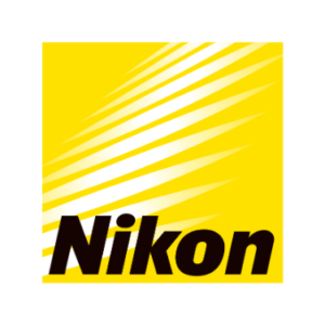
Black And Yellow
- Combining black and yellow gives your logo design a bright and friendly vibe.
- This combination conveys to your audience that you place them at the centre of business operations.
- For instance, Nikon‘s black colour denotes quality and yellow signifies passion.
Green And Yellow
- Blending green with yellow helps brands represent their commitment and values.
- Subway is the perfect example where its logo symbolises positivity, health and a natural approach towards fast-food eating.
- Its vibrant colours define a great deal to having a fresh meal at Subway rather than other fast-food joints.

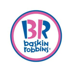
Pink And Blue
- Generally, these two colours complement each other.
- In some cultures, pink and blue are seen as gender opposites.
- If we talk about its balanced composition, Baskin-Robbin is the ideal example of how this beautiful combination conveys warmth, trustworthiness, and dependability.
Logo Design Colour Trends in 2023
The below-mentioned colour trends of 2023 are all about giving your logo’s design a warm and welcoming approach.
Peppy Orange
- In the past year, orange has gained massive popularity and has emerged as a favoured colour for logo design.
- Orange has been considered the favourite colour for vintage branding and logo design.
- Moreover, this colour also works well with yellow and some shades of green and that too on its own.
Green
- Being one of the most restful colours, green gives a calm and rich look by resurfacing a logo design.
- Also, green is known to chill down a yellow and bright orange colour: industries that require a mild, cool, and composed appearance for their logo design always prefer this colour.
Maroon And Beige
- The assortment of beige and maroon results in a cosy and warming combination.
- One of the best things about beige is that it can become a base for any design and be mixed with vibrant colours.
Putting It All Together: Case Studies of Effective Logo Color Choices
After knowing the combinations and trends, let’s dive into some case studies of logo design of big players like Amazon and Adidas and confine why they went for only those shades.
Amazon

The reason why Amazon went for the shades like orange and black is that they hold a deeper meaning that conveys the message and value of the company.
The colour black represents dominance and grace, which Amazon strives for. Amazon wants to be the best in what it does and sets the standards for others to obey it.
On the other hand, the orange colour tries to transmit joy and satisfaction among its users.
In short, a simple font mixed with an impeccable combination of colours powerfully expresses what Amazon is trying to represent.
Adidas

The logo of Adidas, which has three stripes, represents:
- Mountains
- Challenges
- And goals which people need to overcome
To be more precise, the actual meaning or, say, hidden meaning of the Adidas logo conveys how an individual can overcome difficulties to attain higher victories. And that is why there are three stripes in the Adidas logo which, when combined, form the slope of the mountain.
Talking about its colours, then, black isn’t a colour. It is an absence of colour, while white combines all colours representing simplicity and cleanliness.
Conclusion
Now that you know about the psychology behind every colour and how you can choose them, it’s time to infuse your colour palette into your business and see what magic it does.
Your colour scheme allows your brand to communicate and form an emotional connection with your audience.
Since the purchasing power is driven by emotion- says Inc, there’s no refuting that colour plays a crucial role in logo design and branding.
So if you’re looking for logo designers in Melbourne who can compliment your colour palette with your logo design, there’s no one better than our design agency in Melbourne.
Fill out this form and get a free consultation with the experts.
Articles.

April 2024
How to Design a Skateboard Graphic?
Ever gazed at a skateboard and thought, “How do they make it look so...
April 2024
Common Branding Mistakes to Avoid in 2024
Whether you’ve just launched your business or have owned one for years, one small...
April 2024
Why Is Branding Important For Business?
Picture this: You walk down a street and see two cafes on either end....