6 Essential Principles of Logo Design
Published: May 19, 2023
“Even when people can’t read, they will remember signs.”- Karl Lagerfeld.
A good logo has the dominion to enhance your business significantly. But that’s only possible when your logo is packed with multiple elements (principles) like it should be simple yet distinctive.
As logos are the oldest form of visual communication, it’s one of the most crucial aspects of branding. An ideal logo design with principles (not only) helps a brand convey its offering, messages, and values to its intended audience but also helps maintain its credibility and authority over its competitors.
While there are numerous tutorials and agencies out there that just add the company’s initials to some elements along with some fonts.
But for me (Hey mate, Kate here, owner of Award-Winning logo Design Agency Melbourne -BrandVillage), designing a logo is like jotting down your whole business into 250 to 400 pixels.
You may ask why?
Because, being a user, you catch the logo as a small picture.
But, for BrandVillage, a logo is a visual representation that mirrors your brand’s perspective that has to be curated, keeping all the principles in mind.
And in this blog, we’ll look at some of the most iconic brand logos to exemplify how these principles have influenced the success of these logos.
Advanced Logo Design Principles that Help Stand Out of the Basics
#1 Simplicity
Simplicity is the fundamental aspect of designing a logo.
Why? Because Simplism allows logos:
- To communicates effectively.
- Make it memorable and recognisable.
- Keeps it away from being busy.
The more you ornate and add details to it, the more chaotic and scattered it becomes.
So the best logos are the ones that are clean, scalable in size, uncluttered, and gives a clear sense of YOU.
For instance, take the logo of Nike. Since its inception, the Nike logo has evolved through these years but has the same level of simplicity.
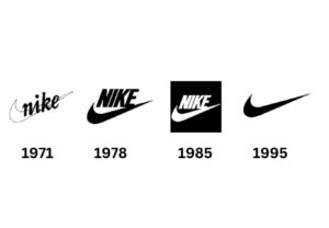
From 1978 when the Futura Bold replaced the cursive serif font with E running more into the Swoosh, to 1995, when the text Nike was removed and only allowed Swoosh to stand there.
Basically, what they were trying to do was:
- CEO Phil Knight wanted a logo to be adaptable.
- It should work well on every product.
- It must be impactful within seconds (due to shorter attention spans).
- And must create a robust identity in front of your target audience (because he was clear about what he wanted for Nike).
#2 Originality
Every business tycoon wants their brand’s logo to be the standout star. And there’s nothing inappropriate about it because originality is the key ingredient that attracts attention and makes a logo memorable.
For instance, think of this multinational conglomerate holding company called FedEx.
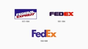
FedEx’s logo has its reason for working and secret ingredients, which give its logo an originality element.
- First, incorporating the FedEx logo showcased the company’s newfound relations with the US government, which increased its distinction and visibility.
- The second logo, launched between 1991-1994 alongside the first one, had a simpler design due to its well-used negative space along with covering the logo’s elements.
- The third one, which is the present one launched in 1994, replaced with pastel orange and lilac shades, has a hidden arrow that cleverly conveys the message of progress, trust, and precision, which speaks volumes about its innovative design.
In short, FedEx’s logo acquaints us that:
- How to combine two distinct fonts (Universe 67 and Futura Bold).
- Why it is necessary to try different heights of characters.
- And how simply but effectively the hidden arrow design indicates that the company’s success and growth are in the right direction.
#3 Versatility
Whether the brand is big or small, the logo has to be used across different mediums and platforms, including billboards, business cards, product packaging, social media and more. And that’s precisely why your logo needs to be versatile.
Just assume how it will look when you see your brand’s logo (pixels) on some of your products getting distorted.
That is why having a logo that is sharp, on point, and looks professional will aid in capturing the attention of potential customers.
Google is the perfect benchmark for proving this principle.
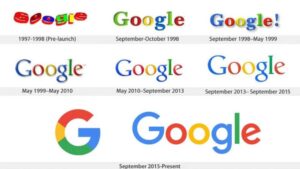
This tech giant went through the biggest change in 2015 due to the appearance of the mobile era, where their old Sarif font wasn’t adaptable and versatile. So its old logo paved the way for its new custom linear font, which was more flexible.
#4 Scalability
It’s vital for your logo to be scalable and can acclimate in any size. Whether it’s a pen, tiffin box, uniform, or school bag, the logo has to make sense and is legible for any format.
Being one of the core principles for logo design, scalability has a few more factors that must be covered and followed. For instance:
- The logo needs to be straightforward (without including more details).
- It must have a good assortment of fonts and colours.
You don’t want your logo to be jumbled when it’s printed in small or large formats. Similarly, you & I both don’t want our logo to blunge with similar colours.
And that is why it’s significant for a logo designer to research and jot down all the details and curate a scalable logo that supports every size format.
Nike’s brand truly resonates with this principle because of its Swoosh logo.
#5 Balanced And Proportion
Balance and proportion are not only essential aspects of design but also crucial for humans as they find a balanced composition stunning.
You see, a well-proportioned design of your logo has the perfect balance between the elements.
Proportion in the context of design refers to the relative size of elements that builds up your entire logo.
And if we talk about balance design, then the symmetrical logo is the perfect example of this, where the left and right sides of your logo elements are equal.
McDonald’s is the perfect example of this principle of logo design.
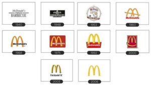
Reason? Because many companies use this symmetry feature in their logo to convey a specific message, and that’s exactly what McDonald’s logo has done by evoking a sense of friendliness, care, and safety.
#6 Timelessness
In the context of logo design, the term timelessness means that the logo must avoid depending on trends and abide by the test of time.
Usually, this principle is challenging to put off, but Coca-Cola has pulled off this element pretty well.
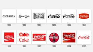
And there’s a quite simple reason behind it. Coca-Cola’s logo has been relevant and remembered by its audience for over 100 years with minor changes. How? Just by keeping it simple with striking visuals. Not just visuals, the logo of Coca-Cola have:
- Embedded the brand’s tone.
- Communicated its brand’s story (with ease) because of its conspicuous design and timelessness.
- And also makes its buyers feel like they are part of a fun-loving and good-times club (because of its well-balanced elements).
Conclusion
Before concluding this blog, I just wanted to articulate that before you hit up your designer for your brand’s logo, just sit back and think deeply about what you want your logo to convey.
Because logos are just symbols that cannot express in words, you need to give them meaning by yourself before you want your logo to serve its actual purpose.
Spare some time out and think about your brand, why it requires a visual identity, and what makes you superior to your competitors. Once you have that figured out, you can start thinking about what colours and symbols work best to represent your brand.
And if you are baffled about how to move further or hire someone who matches your mission and vision, and focuses on these principles, then BrandVillage is someone you can lean on thoroughly.
BrandVillage is a leading design agency in Melbourne with a team of seasoned pros with 5 years+ of expertise in delivering excellent logo design, graphic design, and web designing services.
We also offer a free consultation call to help you easily untangle the baffling world of branding.
Articles.

July 2024
What is a Website Hosting Service?
Did you know that 88% of web users abandon sites due to poor performance? Also,...

July 2024
What is Branding in Marketing?
Branding sets a business apart, influencing: 34.6% of shoppers to repurchase 89% buy from...

July 2024
7 Commonly Used Branding Strategy
In Melbourne’s vibrant and ever-evolving market, a strong brand is no longer an option;...