Explore 13 Types of Logos: Find the Perfect Design for Your Brand
Published: May 17, 2023
A business or brand’s core identity is through a logo design, the first message of a brand that viewers go through. People recollect their experience with the brand or recollect a product or service through a logo. Therefore, design agencies carefully convey the brand message and form an impression.
“Hi, I am Kate, BrandVillage’s founder, and designing is my passion. Among the best approaches I take is to pick a logo for a business or brand and check different types that fit the best for the brand. We provide logo design, website designs, social media, and branding through our professional team and deliver the best in the industry.
As a designer, I always pay attention to the types of logos and their uses that represent the brand’s identity, quality, and characterisation. It would help if you recognised the logotype that perfectly represents your brand and which logo type fits best with your business.
Based on my expertise and experience, let’s analyse 14 different types of logos that can be used for different brands and industries, and trust me, a precise logo type selection has helped me a lot to scale in my 5+ years of designing and branding career!”
13 Logo Types and How to Use Each of Them!
The best logo design combines several elements, including colour palette, images, font, etc., and cohesively balances when you know the logotype you want to create. The two primary groups are name-based logotypes and icon-based logotypes. Here are the 13 logo types that fit into these categories:
1. 3D Logos
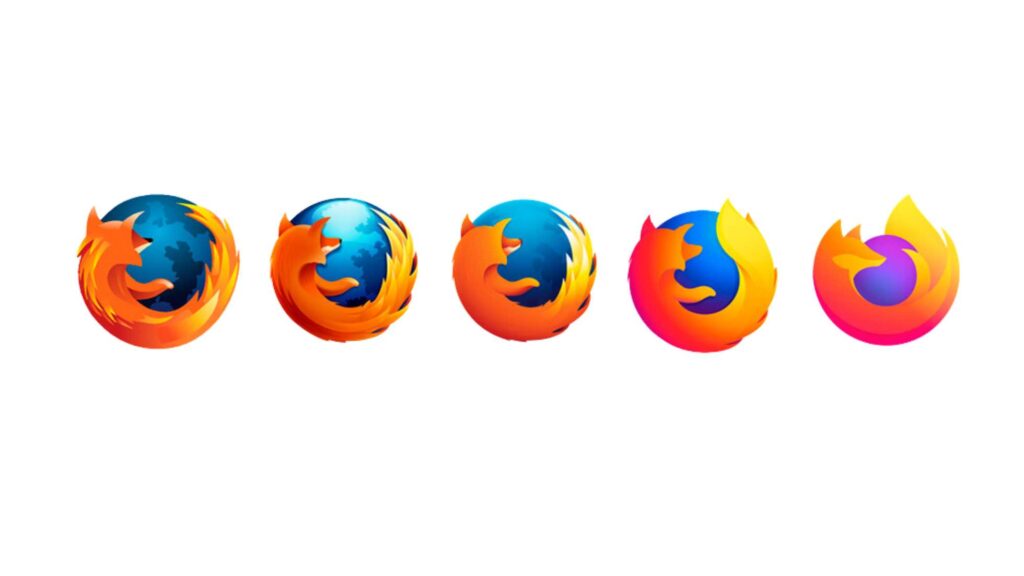
An additional layer of distinctiveness can be given to your logo with 3D or three-dimensional designs. You can make the logos like Mozilla Firefox, appearing like it’s designed with a metal or its shape appears as an actual object. Designing three-dimensional logos necessitates specialised abilities to add shading, perspective, a few highlights at the right part, and doubling up some shapes.
2. Abstract Logos
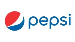
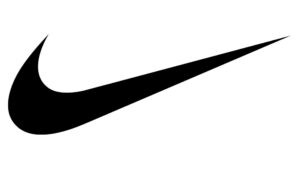
When creating an abstract logo and the message the brand wants to convey, you must completely know the story and purpose of a business or brand. Abstract logos can be in geometric form to represent a brand, such as the logo designs of Pepsi and Nike. One pictorial depiction functions perfectly and confines a brand through an abstract logo.
3. Animated Logos
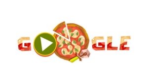
Irrespective of the style, logotype can be animated since it is a viable choice. The ideal animated logotypes are like Google Doodle, which employs the original shapes moving organically. However, if your animation doesn’t have a seamless flow, it will be an obstruction rather than a possession and may lack harmony.
4. Combination Mark Logos
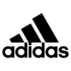
You can combine different logotypes rather than sticking to one type, as with Adidas, which uses symbols and logotypes together. You can combine several elements to test and notice the result. A wordmark or letter logo can be combined with a symbol to design an extra layering of uniqueness. When your business has an image, the logo design will have versatility and will enable viewers to immediately connect the symbol or mascot with the brand and your identity.
5. Dynamic Logos
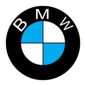
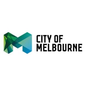
The dynamic mark is the newest addition to the logotypes where the overall design stays as it is, but its appearance transforms continuously. Many businesses or brands, like BMW, employ dynamic mark logos to convey the dynamism, change, and movement of their identity, business, or brand. The City of Melbourne’s M shape dynamic mark logo exhibits differently at all places since it transforms its colour.
6. Emblem Logos
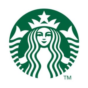
Emblem logos are the oldest ones and remain in demand. These logotypes include an icon or symbol with badges, crests, and seals and are mostly preferred for the auto industry, government agencies, schools, or organisations. Starbucks’ iconic logo, as a name written with an emblem, gives a modern look to a traditional emblem, reflecting the essence of their businesses with conventional design.
7. Lettermark Logos
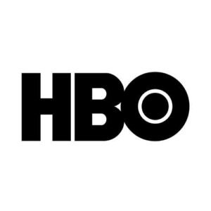
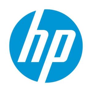
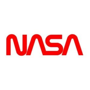
Some logos that include the brand name, as with HBO, HP, and NASA, are monogram logos, or letter marks logotypes. Their names are not in long forms; instead, they have the initial form, exhibiting their brand in two to three phrases rather than opting for the complete name. Such logotypes are unforgettable since the brands employ initials rather than catchy images.
8. Letterform Logos
Letterforms or logos are the minimal versions of letter marks or monogram logotypes. The brand marks like IBM used a letterform logo to make their brand name appear bold and beautiful. These logotypes are scalable, making them useful for appearing on printed materials to the web and app icons. Businesses use logo variables for different touchpoints and platforms. Hence, a letterform in wordmark encloses each of the potential requirements of a logo and invokes the complete identity of a business or brand.
9. Letters Inside Shape Logos
Phrases inside the shapes are letters inside shapes logotypes like that of Subway similar to the emblem, but only complexity level differentiates them. This design makes a logo unique, offering a letter mark or wordmark to the style. You can take any shape that perfectly matches your brand’s story or purpose. You must consider the letters inside the shape logos depending on if they represent your business or brand. This logotype provides a backstory when you choose a shape that pops up and makes it unique.
10. Mascot Logos
Mascot logos, including anthropomorphised or illustrated characters, are usually joyful, cartoonish, and vibrant. Mascot logotypes are ideal when a brand or business requires representation. Sports teams, service companies, and food brands, like KFC, prefer mascot logo types since their goal is audience familiarisation.
11. Negative Space Logos
Negative space logotypes are creative and unique choices to utilise empty spaces to show a graphic, shape, or symbol. Depending on your purpose, you can give it very clearly or subtly. The logotypes contain dual visuals; the encased one and another that surrounds them, FedEx is one of the hit examples of a negative space logo.
12. Symbol or Pictorial Logos
Pictorial or symbol logotypes are created with graphics, visually representing the brand’s function or name. The best example of pictorial or symbol logotypes is Apple’s logo, that perfectly represents the brand. Such logotypes can have shape compositions, illustrations, or icons, which are easily recognised.
13. Wordmark Logos
Wordmark logotypes are brand names in different forms. You can try stylised letters and customise them individually. The beverage brand, Coca Cola has used a wordmark logotype typed in a unique font. A letterform, mascot, or symbol is required for a logo designed in wordmark type for using its smaller version. However, a combination mark logotype may not be required.
Select The Best Logo Type For Your Brand
Selecting the logotype completely depends on the type of brand and the message to convey.
Suppose you select a letter mark or emblem logo, but later you may require some adjustments in your design, which may become your second preference. Therefore, you must try every logotype with a combination mark, word, or letter.
Our logo designers in Melbourne will help you choose the right logo type, depicting your brand or business and perfectly boosting the brand image. Contact Us Now!
Articles.
April 2024
How to Design a Skateboard Graphic?
Ever gazed at a skateboard and thought, “How do they make it look so...
April 2024
Common Branding Mistakes to Avoid in 2024
Whether you’ve just launched your business or have owned one for years, one small...
April 2024
Why Is Branding Important For Business?
Picture this: You walk down a street and see two cafes on either end....