What is the Woolworths Logo?
Published: July 28, 2023
We are all aware of how big brands undergo rebranding to cater to the needs of their audience. But, some brands often change their logos to ensure they are relevant. This applies to established and small brands. One such prime example of a brand changing its logos is Woolworths.
Woolworths is one of the most successful businesses in Australia. Being a huge supermarket chain, they are currently based in 1000+ locations. They have managed to create successful rebranding strategies through their designs.
As a founder of a top-rated logo design agency in Melbourne, let me help you understand the evolution of the Woolworths business logo.
History of Woolworths logo
![]()
You will be surprised to know that Woolworths was founded approximately 98 years ago, in 1924. However, their first logo came into being in 1927. Since then, they have undergone various changes in their logo design format to drive more relevance and deliver service messages through the logo.
The first logo was designed in 1927 and truly stood the test of time as it existed till 1927. During this era, they had a solid black uppercase W. The five-star symbol was all around the logo. There was a thick black outline in the logo.
Their logo was first changed in 2010 when the stylized version was changed into a much simplified one. They had a bold white W written against a backdrop of black. It conveyed the message of The Fresh Food People. The message was clear that they were involved in green delivery.
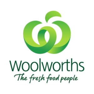
Last year in 2022, the logo was changed to create a more relevant connection with the brand. If you look closely at the new logo, it seems like a W. However, it also slightly represents an apple. This can be taken into account that through the logo itself, the brand conveys the message that they are into the green vegetable business. Moreover, unlike the previous generation logos, the current logo uses vibrant colours. According to colour theory, using these vibrant colours will help establish a connection with the audience.
Meaning of Woolworths Logo
Woolworths is affectionately called Woolies in Australia. It is a grocery store. The symbolic Apple-like W logo can be considered to be a sign of their grocery business. Apart from an offline store, they also have an online store. The use of unique font, colour and style defines the major elements of the logo.
Elements of Woolworths Logo
Some of the major elements of the Woolworths logo that contributes to its success are as follows:
Colour: The logo’s W has different shades of green, which helps add depth. Moreover, green W can also be considered a fresh set of apples.
Font: The name is written in the title, whereas their slogan is written in lowercase. While the name appears to be digital, the slogan is hand-written.
Conclusion
Woolworths logo is an example of the most commendable and memorable logo in Australia. Over the years, the minimum changes have led them to become a household name as they expand. Their logo itself is enough to win over the trust of the audience.
If you want to create such an impact with your logo, you must also connect with BrandVillage. We help you craft logos that stand true to your name.
Articles.

July 2024
What is a Website Hosting Service?
Did you know that 88% of web users abandon sites due to poor performance? Also,...

July 2024
What is Branding in Marketing?
Branding sets a business apart, influencing: 34.6% of shoppers to repurchase 89% buy from...

July 2024
7 Commonly Used Branding Strategy
In Melbourne’s vibrant and ever-evolving market, a strong brand is no longer an option;...