Why Did Google Change Their Logo?

Published: August 16, 2023
Where the world is only filled with clutter, simplicity conveys an assertive message, and Google is a prime example of this.
The name and logo of this company have become its own verb in the dictionary.
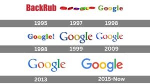
It was pretty shocking for the users to know when this fully automated search engine, also known as BackRub (with 3.5 Billion searches made daily), decided to make a change.
But, much like everything else, Google had a reason behind it.
Google, in one of its blog posts, mentioned that once upon a time, Google was a destination that could only be reached through a desktop.
But in today’s alpha generation, where technology has changed the way we behave and operate, Google wanted its logo to reflect that this search engine is no longer a site; instead, it’s a cluster of apps and services that you can access through your Smartphones, TVs, and laptops.
Google wanted its users to imply how Google works for them.
But you may ask how? Just keep tabs on the blog below to get all the info.
Meanwhile, if you also want your brand’s logo to be simple and memorable as well as convey your values, boost sales, and resonate with your target audience, get in touch with the expert logo designers in Melbourne.
What Really Is So ‘New’ About Google’s Logo? And Why Did It Change?

Unlike Kedar’s previous design (for Google), which had a few minor changes like serif font, removal of drop shadowing, and a slight colour enhancement, this new logo has a sans serif typeface with the same preserved colours like blue, red, yellow, and green also accompanied with a specialised G character which is mainly used for app’s icon.
But you might be asking yourself, what was the intent of the transformation?
- Simplification.
- And the motive to make it work on the tiniest screens.
Now if we view Google’s standpoint from a branding perspective, the motive was quite clear: brand recognition for the long run.
Icons (logo) propel brand recognition, and they portray our brand’s community distinctiveness.
Besides this, the makers also wanted their users to look at them as the modern brand that serves as a pathway to:
- Learning
- Thinking
- Sharing &
- Let them find their own path.
What’s The Take On Google’s New Logo?
Google’s new logo had a polarized response.
Some of them also compared it with comic sans.
One of the most opinionated posts was from an award-winning comedian, actor, and author Lane Moore.
- She wrote- a moment of silence for the new Google logo and the people who think it looks good.
The other was from Sarah Larson, a reporter at The New Yorker said- this logo evokes:
- McDonald’s french fries.
- Children’s refrigerator magnets.
- Suspicion at a shady rebrand.
Conclusion
You might be thinking, what will be Google’s next branding strategy or redesigning aim in the upcoming years?
Well, time will reveal the truth, but if there’s one thing that we can learn as users from Google due to the changes they made over the last couple of years is that this multinational company wasn’t afraid of making minor changes to keep up with the time.
So if you’re looking for a logo design agency in Melbourne that can unite the worlds of science and art to metamorphose your brand with a uniquely crafted logo, then BrandVillage is your place.
Connect with our expert designers to ace your growth.
Articles.

July 2024
What is a Website Hosting Service?
Did you know that 88% of web users abandon sites due to poor performance? Also,...

July 2024
What is Branding in Marketing?
Branding sets a business apart, influencing: 34.6% of shoppers to repurchase 89% buy from...

July 2024
7 Commonly Used Branding Strategy
In Melbourne’s vibrant and ever-evolving market, a strong brand is no longer an option;...