How did the Nike Logo Originate?

Published: August 3, 2023
Have you wondered what is one of the most recognizable and identifiable logos? While most of you agree it is the Coca-Cola logo, think a little harder. A recognizable logo should be simple. And, honestly, no brand ticks this checkbox as simply as the Nike logo.
The ‘Swoosh’ design is itself enough to trigger anyone’s memory. The moment you see a ‘Swoosh’ or simply put a ‘tick’ sign on any accessory, you’d know the brand’s Nike. But have you wondered how the logo originated? Our Melbourne-based logo designers provide comprehensive information on the history and origin of the Nike logo.
History of the Nike Logo

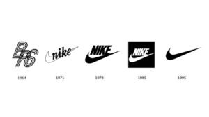
Established in 1964 as Blue Ribbon Sports, the brand had a completely different design. Soon, the company transformed its name to Nike, and gradually, the Nike logo appeared. A graphic design student from Portland State University, Carolyn Davidson, had designed various logos as an option for the company.
The Swoosh logo was first used in the first running shoes by the company Nike Cortez. In 1983, the designer was paid a mere $35 for the design. Davidson also received a Swoosh diamond embedded ring and an envelope containing Nike stock from Phil Knight.
Some suggest that Knight told Davidson that the logo reminded him of the wing of Goddess Nike from Greek Mythology, acting as a significant part of the logo brief. Even in today’s time, the logo works very creatively. It acts as a symbol of positivity and reflects the brand’s inspiration.
Origin of the Nike Logo

The inspiration for the Nike logo was taken from the Goddess Nike of Greek mythology. Davidson also agreed to have taken inspiration from the source. She took 17.5 hours to design the logo. The simplicity and recognizability are what make the logo memorable.
Since its origin, the logo has been associated with and used in different products. Nike has partnered with some of the most prominent athletes like Tiger Woods, Kobe Bryant and LeBron James. The logo has its presence across sports and athletics. The brand identity through the logo design also makes more people interested.
Over the years, the Nike logo has become one of the world’s most unique and iconic brand designs. Any product that has this logo is symbolic of offering quality and excellence.
Transformation of the Nike Logo
Initially, the Swoosh design featured wings on either side. However, it was much later, in 1978, when the logo was more streamlined. With a simplistic approach to the design, the brand aimed to create a stronger market. What’s more iconic is that the price of the logo back then was $35. Today the same logo is worth millions. If you want to know more about check this out how much is the nike logo worth?
The transformation of the logo into a more simple aspect encapsulates the values and aspirations of Nike truly. It embodies the craft and excellence of the logo. Moreover, it transcends cultures, generations and languages.
Conclusion
The Nike logo is a symbolic representation of simplicity that aims to create a long-lasting impression. The logo truly upholds the spirit of athletics. The Swoosh can also be regarded to be a representation of the smoothness that the brand brings to the customers.
If you want the same iconic characteristic to be preserved in your logo, Melbourne’s Leading design agency is ready to help you. So, don’t wait any longer; if you want to contact us, Just Do It.
Articles.

July 2024
What is a Website Hosting Service?
Did you know that 88% of web users abandon sites due to poor performance? Also,...

July 2024
What is Branding in Marketing?
Branding sets a business apart, influencing: 34.6% of shoppers to repurchase 89% buy from...

July 2024
7 Commonly Used Branding Strategy
In Melbourne’s vibrant and ever-evolving market, a strong brand is no longer an option;...