What is Bleed in Graphic Design?

Published: April 18, 2024
Ever notice those unwanted white borders and uneven looks on brochures or business cards? These small mistakes affect how people see your brand, reducing interest and trust and even causing a loss of opportunities!
That’s where “bleed” in design comes into play.
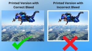
Bleed is a pre-printing process that involves extending design elements or images slightly beyond the edge of the final print area. This ensures that there are no white edges when the paper is trimmed, resulting in a flawless, edge-to-edge color or design.

With over 8 years in the industry, I’ve seen firsthand at BrandVillage how designs lacking proper bleed negatively affect potential customers. This insight has driven us at BrandVillage, a graphic design agency in Melbourne, to ensure every project receives the meticulous attention it deserves.
For us, it’s more than just avoiding unsightly white edges. It’s about ensuring your brand’s message is delivered with clarity, professionalism, and impact. Whether it’s a small business card or a large banner, we’re committed to providing work that truly reflects your brand’s excellence. At BrandVillage, an award-winning design agency we focus on those essential details that make your brand stand out and capture attention.
Overview of Bleed in Graphic Design

Bleed is an important concept in graphic design, ensuring your print collateral looks flawless. It refers to extending background colors, graphics, or images beyond the final trim size of a document.
Bleed is important because printers can’t always apply ink right up to the edge of the paper. By adding bleed—a buffer zone around your design—you prevent unwanted white edges caused by slight shifts in printing and cutting.
This ensures a seamless transition of design elements to the edges of your final printed piece, delivering professional, eye-catching results. Understanding and applying bleed is key for any print design, making it indispensable for creating visually striking and accurately trimmed printed materials.
Importance of Bleed in Graphic Design
Bleed is a crucial but simple concept in printing that ensures your final product looks exactly as intended. Here’s how it matters:
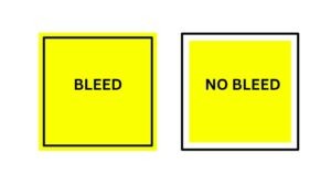
- Bleed means your design extends slightly beyond where the paper will be cut. This extra space stops white edges from appearing on your final print, ensuring a clean, edge-to-edge look.
- When you’re printing multiple items, like flyers or business cards, bleed, make sure they all look the same. It compensates for slight shifts in the cutting process so every item looks consistent.
- By using bleed, designers don’t have to worry about important parts of their design getting cut off. This means more freedom to use vibrant, full-page images without losing any part of the design.
- Correctly using bleed from the start means you’re less likely to need reprints due to cutting errors. Getting it right the first time can save you both time and money.
- Designs extending to the paper’s edge look more engaging. Bleed helps achieve this seamless look, making your printed material more eye-catching.
How Much Bleed for Print?
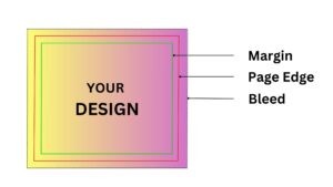
Ensure a bleed of 0.125 inches (3 mm) surrounds your document for optimal printing outcomes. This extra space allows your design elements, whether images or color fills, to spill over the intended cut line. For instance, a standard business card design, sized 85 mm x 55 mm would need its design to stretch to 91 mm x 61 mm to incorporate the bleed. Here’s how to make bleed work for you:
- Stretch your visuals: Ensure visuals like photos or color backgrounds go beyond the document’s boundary.
- Adjust bleed settings: When generating your PDF, apply a 3 mm bleed margin.
- Create a safety zone: Ensure a safety buffer of about 0.25 inches around your content to keep crucial details from being trimmed.
- Account for folds: For foldable designs like greeting cards, extend the front image slightly beyond the fold line for continuity and maintain a 5 mm clear area from the edges to keep text secure.
Graphic design software free and paid, also has its own guidelines for bleeding in their designs. Ensure to check the details before printing for the best outcome.
List of Full Bleed or No-Full Bleed Products
A few products in print will have an automatic full bleed. Usually, the price for full-bleed products is included in the design. Therefore, it is advisable to leverage it.
Some of the products that may be available in the market with full bleed include:
- Postcards
- Pocket folder
- Bind book printing
- Saddle stitch booklet printing
- Brochure
Other products may not have full bleed designs. Therefore, the full bleed designs will need to be implemented on it for an extra price. These include:
- Spiral binding
- Mini posters
- Black and white copies
- Colour copies
- Wirebound book printing
Common Mistakes to Avoid for Bleed in Graphic Design

While including bleed with graphic design trends, we are careful with our design. Our designers are particular about maintaining the adjustments to avoid potential pitfalls.
Here’s a look at some of the common mistakes to avoid:
- Your borders play an essential role in graphic design. However, adding white borders as bleed is never a good idea.
- Cut marks are a big No-No for bleeding. Our graphic designers are particular about not including these cut marks.
- The safety margin and entire bleed area should be left blank. However, some designers include critical texts in this area. Do not do it. Including essential texts in the safety margin or total bleed area can lead to the text being omitted during printing.
- Expanding the file and increasing the dimension of the design. You should not expand the file and increase the dimension as it will hamper the alignment.
Conclusion
Understanding the details of bleed is the key to delivering top-notch print designs. It is more than just avoiding pesky white edges. It’s about making print collateral look sleek and professional, providing an impressive experience to the viewer at first glance!
At BrandVillage, my team and I, Kate, put our 8+ years of design know-how into practice, paying close attention to these small yet significant details. From eye-catching brochures to professional business cards, we’re all about helping your brand shine.
We ensure your project stands out by avoiding common mistakes and choosing the right printing options. Ready to take your designs to the next level? Contact us and make your brand’s print materials unforgettable.
Articles.

July 2024
What is a Website Hosting Service?
Did you know that 88% of web users abandon sites due to poor performance? Also,...

July 2024
What is Branding in Marketing?
Branding sets a business apart, influencing: 34.6% of shoppers to repurchase 89% buy from...

July 2024
7 Commonly Used Branding Strategy
In Melbourne’s vibrant and ever-evolving market, a strong brand is no longer an option;...