Why Did Red Rooster Change their Logo?

Published: July 19, 2023
Lately, did you notice any change in the Red Rooster logo? Sure, all of us love the delicious food and nostalgic memories that they offer, but the change in their branding is something worth talking about. We’ve always known Red Rooster for its logo; so this sudden change is surprising.
Well, there may be different reasons as to why Red Rooster decided to undergo this massive change. So, Our Melbourne logo design experts at BrandVillage will help you today to decode the secrets of the change in logo by Red Rooster.
Old Red Rooster Logo

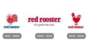
Red Rooster has always been famous amongst its audience for its iconic logo. We cannot deny that they stood true to their name when they featured a literal, bold red rooster on their logo.
The fusion of the red rooster placed upon the restaurant’s name was noteworthy because it truly signified what it stood for, known for the best chicken servings. In the logo designing and branding world, the logo must convey the message clearly and effectively. It’s safe to say, that is something Red Rooster did excel in.
Red Rooster Rebrand

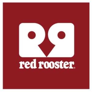
Now, with its rebranding strategy, we see a more personal avatar in place of the traditional red rooster whole image. The new rebranded logo has a vibrant and modern look to it. Moving away from the 1970s era, where design was a little less ‘creative’, Red Rooster has decided to maximise the creativity and introduce a ‘woman or vase’ conundrum to engage us further. At first glance, can you see two R’s or a rooster face?
What we love about this logo is that, apart from visual imagery, their font has barely changed. While font types are a major requirement in a logo, we always recommend doing what Red Rooster has done and connecting your old logo to your new logo through some type of brand element. Whether it’s the same colour, same symbol, or same font, a brand refresh should still be identifiable to the previous brand. In this case, Red Rooster wisely chose to keep the original font. However, they still managed to completely change the logo’s look into something new and exciting.
Why did Red Rooster Rebrand?
It was quite ironic when a leading brand like Red Rooster changed its logo. Their unique logo was their identity; suddenly changing it in this competitive landscape was a bold move. Here are some reasons they would have considered changing their logo.
Relevance
The world around us is changing, and so are we. It would be quite obnoxious to stay stuck in the same old rut. Red Rooster may have analysed that their traditional logo hardly strikes a chord with the younger generation. By changing their logo brief into a more contemporary form, they aimed to attract a younger audience. Well, we cannot deny that they did maintain a dash of the old-school charm in their logos.
Differentiation
All of us want to stay different from our competitors. Well, this is more important if you are in the fast-food industry. We see a rise in many fast-food joints, and to stay apart from your competitors, you need to create a strong, differentiated brand identity. By changing its logo, Red Rooster has created differentiation in the competitive market having an impact on branding. With their contemporary logo design, they easily stand out in the market.
Better Brand Identity
As they say, there is always room for improvement; Red Rooster adopted it. Red Rooster updated their brand identity with its unique and new approach to their logo. With an upgrade in their brand identity, they wanted to inform the customers that they had something new to offer while still maintaining its old-school charm. Their rebranding efforts can easily point towards progress and innovation to stay updated with changing times.
Conclusion
Rising from the offline market, Red Rooster decided to take a bold step for their online presence. This was a well-thought move that eventually contributed to their business’s success. With a strong logo design, they surely contribute to maintaining quality. At the same time, we cannot deny that the change in their logo design in marketing has helped them strike a chord with their audience.
Do you wish to bring such a noticeable and effective change into your business? Well, you will need experts in logo design that make sure that it is functional and informative. Guess what? Your search ends with Melbourne’s leading design agency – BrandVillage. Our expertise will help to give your logo a significant upgrade.
Articles.

June 2024
10 Major Advantages Of Branding
Did you know that 77% of consumers purchase an item based on the brand...

June 2024
How to Make a Website? – 7 Easy Steps
According to research by Forbes, around 78% of small businesses in the UK own...

June 2024
What Is The Best Free Website Design Software For Beginners?
Choosing the right website design software is crucial for beginners. These tools help you...