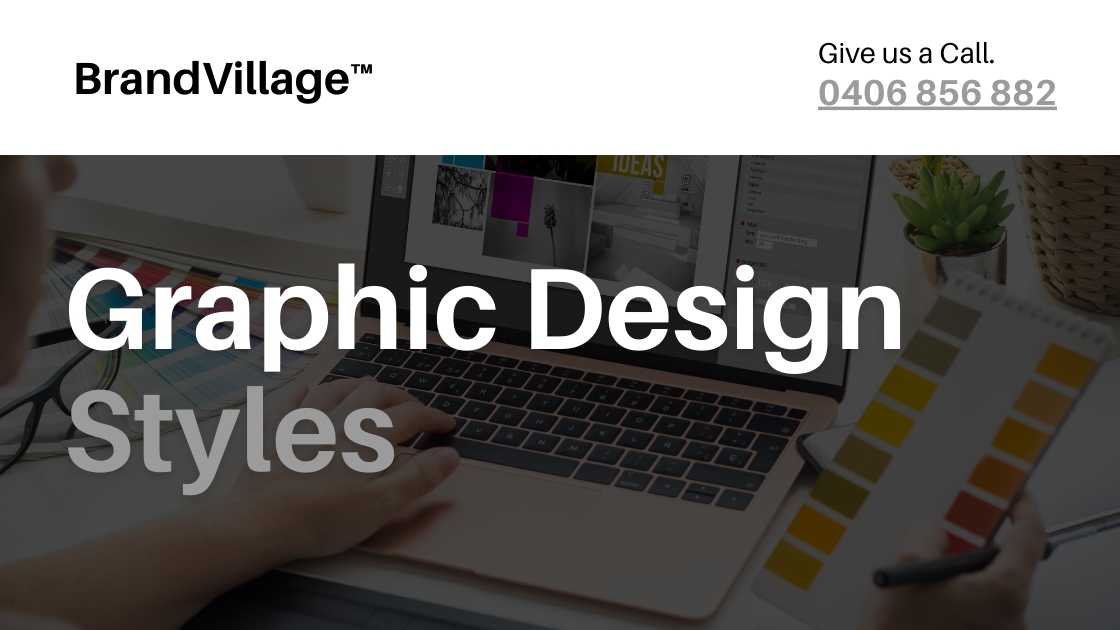
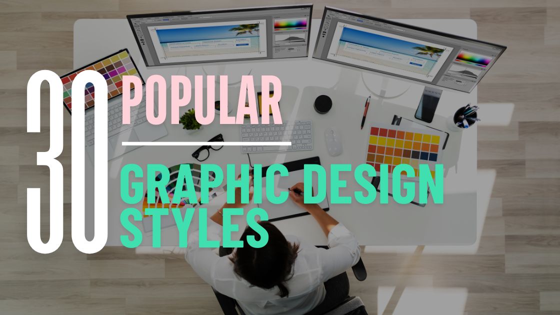
30 Popular Graphic Design Styles Trending in 2024
Published: October 4, 2023
Do you know graphic design is an umbrella term covering various designs? Every graphic design style uncovers a certain mood, feel and appearance.
Businesses have gradually started accepting the different graphic design styles and fusing them into their business. At BrandVillage, we have been helping businesses of all sizes find their style and fuse them into the brand using our expert graphic design skills.
Adopting the right graphic design style will give your business appearance a boost. Check out some of the popular graphic design styles below!
30 Popular Types of Graphic Design Styles
Over the past few years, graphic design has changed significantly. The change in graphic design has led to different graphic design styles that help businesses create a unique identity. The evolution of Graphic design in Melbourne has been evident, reflecting global shifts in design preferences.
Here are some of the most popular styles of graphic design for businesses in today’s time:
1. Minimalism
Although it began in 1920, minimalism holds relevance for businesses today. Minimalism focuses on simplicity, geometric shapes and monochromatic colour palettes.
Using white space in designs and shapes makes a minimalist logo vital in conveying brand messages effectively. The fusion of typography and design elements helps in creating the perfect design.
Unlike other styles, minimalism focuses on minimal shading with bold linework.
2. Retro
Vintage-style logos are coming back with retro designs. A lot of business logos influence old-school design and fonts.
Most businesses are using retro logos to create an impact on the audience. The expert designers believe that including retro logos and designs can often help foster nostalgia amongst the masses.
Retro designs are more complex than they appear to be. They have various decorative elements and illustrations. These aspects range over some time and are active.
3. Maximalism
Quite the opposite of minimalism, maximalism aims to use all graphic design elements to create the perfect result. It uses a bold design and features an oversaturated colour scheme that does not follow your regular balance.
With a lack of traditional balance, maximalism helps fill up all corners rather than just utilising white spaces. With an unexpected mix of colours, maximalism in logo design can be efficient for businesses with a loud personality.
Images, text layering, and texture are the most common practices in maximalism.
4. Typography
Typography has always been one of the most important aspects of graphic design. Through typography, the different styles of fonts for logos and graphics will help in communicating brand messages properly.
Typography may involve fusing different illustrations to create a graphic design style. Text, however, will be one of the most critical components of graphic design.
You should check businesses with text-based logos to observe one of the best typographic logos.
5. Organic
With organic brands taking the front seat, the designs are becoming organic, too. Rustic, natural and Earthy elements are important in organic designs.
Organic designs often feature neutral colour palettes and organic shapes. Most of them often have hand-drawn lines to show uniqueness.
Using plants, leaves, and organic elements is common in such designs. Mostly, eco-friendly brands opt for organic graphic design.
6. Three-dimensional
Three-dimensional designs are giving tough competition to flat designs. The 3D design aims to excite the audience by creating an illusion of reality.
3D designs in graphic design are easily created using shadowing and natural lighting. These play an essential role in creating depth and volume in the design to appear realistic.
Most businesses have used 3D design for animation, web design and social media content.
7. Illustrated
Illustrated graphic design is an umbrella term for different categories. No business can ever go wrong with illustrated designs.
Animation, 3D design, and photorealism are all a part of illustrated graphic design. It often features a hand-drawn look.
Illustrated graphic designs are open to interpretation and are full of life and colour.
8. Grunge
With a very dark and contrasting colour palette, the grunge has a very sombre and dark appearance. It often helps to depict doom or anger.
Grunge would suit your business. Grunge designs are created against a backdrop of gritty textures using distressed shapes and irregular lines.
Grunge has a stained background and often has a relation to punk and gothic elements.
9. Abstract
Abstract designs have always been in trend. Recently, businesses have noticed abstract designs and given importance to them.
Abstract designs for logos often portray a sense of detachment from reality. It provides visuals and images that do not match reality. Abstract art or graphic design is open for interpretation by the audience.
By blending a unique colour palette across the design, businesses use abstract design to create a sense of curiosity in the audience. It uses different tones, shapes, and forms to depict reality in a surreal way.
10. Contemporary
Contemporary design isn’t a fixed style but rather a reflection of current trends, constantly evolving. It incorporates a diverse range of elements like various line styles, shapes, and textures. Examples include bold, cartoonish lines or a minimalist approach featuring a few distinct, cleanly separated colours. The latter, emphasising minimalism, has been especially popular in recent years, showcasing contemporary design’s dynamic and adaptable nature.
11. Flat
The flat graphic design style draws inspiration from the Swiss style, Bauhaus, and Modernism, aligning with minimalist principles by using limited colours and subtle shades to create a two-dimensional effect.
This style, which avoids black borders and favours straight lines with some curved edges, is typified by clean typography. Pioneered by tech giants like Google, Apple, and Microsoft, flat design is prevalent in software interfaces due to its simple imagery that ensures quicker load times and efficient file sizes.
12. Scandinavian
Scandinavian design, a minimalist style from the Nordic countries, highlights simplicity and practicality. This design trend utilises limited colour palettes, straightforward shapes, and curvy, serif-free typography.
It arose from a populist movement that aimed to provide aesthetically pleasing yet affordable designs in contrast to the elaborate Victorian style. Characterised by its extensive use of white space, it draws attention to the most vital elements, effectively combining visual appeal with functionality.
13. Psychedelic
Psychedelic design is known for its intense colours and swirling lines, reflecting the 1960s psychedelic movement, largely influenced by the effects of LSD. This style mimics the altered perceptions from the drug, where lines appear to move and colours are exceptionally vibrant.
The design captures this experience, symbolising the psychedelic journey. You might find our colour wheel charts useful for selecting palettes that suit this vibrant style.
14. Art Nouveau
Art Nouveau emerged in the 1890s as a distinctly modern design style, developed by Western artists seeking a unique aesthetic to promote globally amidst rising trade. This style is ornate and decorative and is characterised by elongated organic lines that frequently depict animals, plants, and delicate items.
Typography in Art Nouveau often features naturalistic serifs and looping shapes that echo the visual elements. Due to high printing costs in the early 1900s, colour usage was minimal, typically employing a single shade like black with subtle shading.
15. Art Deco
Art Deco is easily recognised by its strong geometric shapes, bold colours, and symmetrical design. Influenced by Cubism and Futurism, it often incorporates materials like metal and glass, creating a striking visual impact.
This style is designed to command attention, making it highly effective for websites or advertisements that need to stand out in a crowded digital space. With its distinctive shapes and bold typography, Art Deco remains one of history’s most iconic design styles.
16. New York
The New York design style, originating from a group of artists in the 1950s and ’60s known as The New York School, blends elements of dance, poetry, and music into a bright, free-flowing, and experimental aesthetic. This style often employs vibrant colours and unconventional shapes, like the colourful triangles used in typography, to create a unique effect.
Employing this style in branding or website design can add a distinct quirkiness that attracts attention. It also influenced the development of abstract expressionism, a style focused on purely abstract forms, popularised by Jackson Pollock.
17. Victorian
Victorian graphic design is characterised by its ornate and cluttered aesthetic, filled with intricate shapes, borders, and lettering that reflect the lavish tastes of Victorian-era Britain, particularly its royalty. This style is often symmetrical with quirky, swirling serif typography that adds a unique flair. Due to the limited availability of bright inks, the colour palette is typically muted. This design style evokes a sense of posh royalty, appealing to those who appreciate opulence.
18. Geometric
This design style is centred on geometry, which studies the relationships between angles, lines, and points. It opts for a minimal aesthetic, emphasising balance through straightforward lines and shapes. These simple designs gain depth from varied colour palettes and the integration of images.
19. Modern
Modern graphic design, known as late modernism, emerged post-World War II and features vibrant colors, unique layouts, and irregular geometric shapes. This style typically pairs these elements with simple sans serif fonts. Key characteristics of modern graphic design include a vivid color palette, geometric lines and shapes, and the use of sans serif fonts for text.
20. Corporate
The corporate design style is ideal for brands aiming for a professional look. It typically features conservative design elements and formal fonts, often utilising simple icons and layouts. This style is particularly effective for business presentations and marketing materials. Key traits include simple shapes and fonts, clean lines, and a complementary colour palette, all contributing to a sophisticated and clean aesthetic.
21. Playful
Playful design is particularly suited for content aimed at families with young children, featuring bright, colourful illustrations of animals and people, often with a touch of whimsy. This joyful style is ideal for children’s books and family-focused brands. Characteristics of playful design include animated elements, a vibrant colour palette, and imaginative visuals.
22. Feminine
This illustrative style targets primarily female audiences. It uses cursive fonts, charming decorative elements, and soft pastel colors. It blends well with natural and organic themes. This style’s characteristics include sloped and curved lines and shapes, along with a delicate color palette, creating a gentle and appealing visual experience.
23. Masculine
This design style caters to a primarily male audience, incorporating monochromatic color palettes, rough textures, and thick-stroke fonts. It often features gritty or rugged visuals, lending a strong and masculine feel to advertisements and brands. Characteristics of this style include the use of thick-stroke fonts, a muted color palette, and rugged textures and imagery.
24. Photorealism
This artistic style aims to replicate real-life visuals as accurately as possible, typically starting with hand-drawn pencil sketches by the designer, which are then digitised using vector or raster software. This method is used for creating brand logos or standalone artworks.
25. Swiss / International
The Swiss style, also known as the International Typographic Style, emerged in the 1940s in Switzerland. It’s recognised for its emphasis on readability, simplicity, and objectivity, heavily influenced by the Zurich and Basel Schools of Design.
This style is characterised by its use of grids, sans-serif typography, and asymmetrical layouts. It often incorporates ample negative space and prefers matte colour palettes. Josef Müller-Brockmann, a prominent figure in this movement, is noted for his clean, gridded designs and use of unadorned typefaces.
26. Punk
Punk design, rooted in the late 1970s punk music scene, embodies a DIY, anti-establishment ethos. Originating from untrained designers like band members, it utilises basic tools like scissors, photocopiers, and found materials. Its hallmark features include hand-written or cut-and-paste typography, and a mix of bold serif and sans-serif fonts. Punk aesthetics continue in zine culture and album covers, characterised by low-quality, photocopied images, grainy effects, collaged text, photographic elements, and a rough, textured appearance with high-contrast, bold colors.
27. American Kitsch
The American Kitsch design, influenced by Art Deco and popular from the 1940s to the 1960s in the USA, featured idealised, cartoon-like illustrations. It’s known for using informal shapes, dramatic curves, and space-age forms, with bold, contrasting colours and hand-drawn images. The style often included caricatured imagery and fonts, reflecting the American dream’s idealism in advertising and film posters, particularly in science fiction and fantasy.
Characteristics include contrasting fonts and imagery, bold, vibrant colours, cartoon-like illustrations, people in dramatic poses, and aerodynamic shapes.
28. Conceptual Art
Conceptual art, a branch of illustration, metaphorically represents visual ideas, akin to the fictional section of illustration, as it doesn’t strictly resemble the real objects it’s based on. Characteristics include elements of reality, designer’s interpretation and compatibility with all styles.
29. Luxurious
The luxurious design style conveys indulgence beyond basic comfort, often using rich colours like gold to suggest opulence. Characteristics include utilising black, gold, and bronze colours, employing simple, minimalist designs to suggest impactful branding and using traditional, sleek or modern fonts.
30. Neobrutalism
Neobrutalism in graphic design, inspired by 1950s brutalist architecture, emphasises a raw, honest aesthetic by showcasing bare essentials and structural elements. This trend contrasts with current minimalistic styles by adopting a more rugged, unpolished look with strong colour contrasts, black tones, hard drop shadows, and visible grid lines, prioritising substance over sleekness.
BrandVillage- Fusing Graphic Design Styles with Innovation
BrandVillage, one of the premier design agencies in Melbourne, is your guide and friend in the graphic design journey. We take pride in having some of the best designers who fuse innovation with different graphic design styles.
Our graphic design range helps take your business to the next level. The designs that we create help in elevating your branding efforts. Every design created through a particular style has a unique set of information that creates differentiation for your brand.
Want to know which graphic design style is perfect for your business? Contact us, and we will provide consultation about the best for you.
Articles.

July 2024
What is a Website Hosting Service?
Did you know that 88% of web users abandon sites due to poor performance? Also,...

July 2024
What is Branding in Marketing?
Branding sets a business apart, influencing: 34.6% of shoppers to repurchase 89% buy from...

July 2024
7 Commonly Used Branding Strategy
In Melbourne’s vibrant and ever-evolving market, a strong brand is no longer an option;...