What Is Typography In Graphic Design?
Published: March 14, 2024
You’d be surprised that only 16% of adults can distinguish good from bad typography. As the owner of BrandVillage, an award-winning graphic design agency, I can’t emphasise enough how important picking the right fonts is for creating designs that look great and work well.
Right from the start of any project, we carefully choose the best fonts that not only look nice but also send the right message and feeling for the brand. Typography is more than simply putting words on a page—it’s an art that needs a sharp eye for detail and an instinct for how fonts can affect users’ thoughts and actions.
Through the years, I, Kate, have seen firsthand how powerful typography can be in shaping a brand’s identity and connecting with its target customers. Whether it’s a bold, modern font with no extras for a tech startup or a classic, traditional font for a luxury brand, picking the right font can make or break a design. That’s why at BrandVillage, we leave no stone unturned regarding typography.
What is Typography?
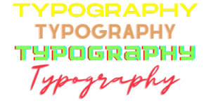
Typography is the art and technique of arranging and styling text. It enhances readability and aesthetic appeal and conveys intended messages. Typography is crucial in creating visually appealing and functional graphic design. It involves –
- Selecting and combining typefaces
- Adjusting letter spacing and line spacing
- Alignment to establish a clear visual hierarchy and ensure legibility
Effective typography can evoke specific emotions and reinforce branding. It guides the reader’s eye through the design. Typography is an essential element that brings the text to life, making it more than words on a page.
Skilled typography use can significantly impact the success of a graphic design project. Whether it’s a book cover, a website, or a marketing campaign, typography enhances communication and visual appeal.
A Brief History About Typography
The roots of typography can be traced back to the 11th century. It was when movable type printing was invented. The Gutenberg Bible, printed in the 15th century, used the Textura typeface. The typeface can still be found in modern software.
As digital technology advanced, typography experienced a creative explosion, particularly in graphic design. Graphic designers now have access to various fonts and typographic options. These allow for more varied, unique digital and print media text styles.
Why is Typography Important in Graphic Design?
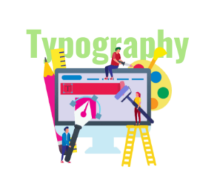
Typography is a crucial element of user interface design. It establishes a visual hierarchy and balances the website’s aesthetics. It also sets the product’s tone and guides users. Let’s explore the importance of typography in the sections below!
- Typography Builds Brand Recognition: Effective typography enhances a website’s personality. It allows users to associate the featured typefaces with a brand. Unique and consistently applied typography helps establish a solid user base. It builds trust and carries the brand forward, making it a powerful branding tool.
- Typography Influences Decision-Making: Information presentation through text impacts how users process and perceive it. Eye-catching, well-designed typography effectively presents the message. It makes the text more persuasive than weak fonts that fail to support the content.
- Typography Makes Text Reader-Friendly: Thoughtful typography ensures easy reading on web pages. Poor font choices can make the content seem complex and confusing. Additionally, tiny or cramped fonts strain the eyes. Even for fun, intricate designs, audiences should effortlessly scan text. Readability also depends on how designers align and arrange text. Traditionally, it is left, right, centred, or justified. However, modern tools offer more flexibility.
- Typography Grabs And Holds The Attention Of The Readers: Good typography can differentiate between users staying on a website for a minute or an extended period. Visually stimulating and memorable typography is crucial in capturing and retaining user attention, making it a key factor in creating an engaging and immersive website experience.
- Typography Establish Hierarchy: Skilled designers use different font sizes and styles to guide visitors’ focus on key information. This visual hierarchy enables locating crucial content at a glance. To create this order, different font sizes are used for headings, subheadings, and body text.
- Typography Gives Value And Tone To Brand: Typography aids in establishing a brand’s values and tones. Each typeface possesses the power to represent businesses differently. It reflects their purpose and principles. With this diversity in typefaces and different fonts, designers convey specific moods and effects. Designers incorporate typefaces that set the appropriate tone. It presents and communicates the desired brand message effectively.
- Typography Creates Harmony: Graphic designers leverage typography to achieve harmony within a design or web page. A harmonious design has an artistic impact on viewers. Using a consistent font for similar content enables immediate recognition and provides continuity. Fonts with proper proportions present a clean, uncluttered appeal to the graphic design.
Different Elements of Typography in Graphic Design
Fonts and Typefaces
A typeface is a design style with a text collection of varying sizes and weights. A font is a graphical representation of a specific text character. A typeface is a family of related fonts with weights, widths, and styles.
There are three main typeface categories: serif, sans-serif, and decorative.
- Serif typefaces small strokes at the end of characters. It lends a traditional, authoritative appearance.
- Sans-serif fonts lack these strokes. These are more modern and bold, ideal for headlines.
- Decorative typefaces prioritize aesthetics over readability. They are used for logos, brand names, and short titles. They showcase personality and uniqueness.
Hierarchy
Creating a clear hierarchy and distinguishing the most important text from the regular text is crucial. The attention span for a design is only around 8.25 seconds. Designers must be concise, using size, colour, contrast, and alignment as visual cues. These quickly guide users to essential info, like larger, contrasting calls to action.
Contrast
Contrast draws the reader’s eye to key ideas or messages. Designers create contrast by mixing fonts, colours, styles, and sizes. This makes the text interesting and meaningful and grabs attention by dividing the page.
Consistency
Keeping fonts the same is key to avoiding a messy, confusing layout. Sticking to one font style is also key when sharing information. It helps readers understand what they’re reading and spot patterns.
Using a few different text sizes is okay. But it’s best to pick one font for headings and another for subheadings and stick to that.
White Space
Often ignored, use plenty of blank space around text or images. It keeps the layout clean and makes text easy to read. Negative space is like margins and padding with nothing in them. It can highlight the text and make the whole design look nice.
Alingment
Aligning organises text, graphics, and pictures with equal spaces and distances between them. Designers use margins to line up logos, headers, and body text. Following standard practices like left-to-right text for left-to-right readers makes sense when aligning layouts.
Colour
Colour is an exciting way for designers to get creative with text and improve layouts. Picking the right text colours makes the wording stand out and sets the tone. However, bad choices create clashing, messy layouts. Good designers balance brightness, shade, and vibrancy for eye-catching, readable text. They often check in black-and-white view.
Leading
A vertical space between lines of words.
Leading Value
It is the distance between two text lines, usually more than the font size.
Kerning
Space between letters and characters.
How to Choose a Typeface for Graphic Design?
- Think About Personality – How do you want users to feel on your website? Friendly, high-end, welcoming, playful, or serious? Typography should reflect the brand’s personality. Define your core traits and gather typefaces that mirror those traits to notice trends.
- Reflect On Tone – Consider how the font harmonizes with the message’s tone. Choose legible fonts without stylized decorations to limit distractions for serious or important information.
- Don’t Skimp On Function – Function is as vital as form. Avoid websites that look pretty but are illegible, leading to mistakes because instructions are unclear. When choosing typefaces, prioritize legibility, readability, and accessibility over style.
- Consider Performance – Choose web browser-friendly typefaces. Popular web font libraries offer files that render perfectly in browsers. *Pro tip: Only include necessary character sets to avoid excess weight when downloading.*
- Get Inspired – Observe the typography around you. Notice patterns? Good and bad examples? Follow typography on social media or Pinterest for inspiration.
- Take Some Time To Test – What is the best font choice? Test, test, test! Gather real user feedback to gain insights into what works, what doesn’t, what’s legible, and what feels counterintuitive or clunky.
Conclusion
In the world of graphic design, typography is the silent ambassador of your brand. It’s not just about making words readable; it’s about crafting an experience that resonates with your audience. As we’ve explored, the suitable typeface can elevate your brand, communicate your values, and guide your users with ease and clarity. Remember, every font tells a story.
At BrandVillage, we’re passionate about finding the perfect typographic voice for each brand we work with. Let’s not let the nuances of typography be an afterthought. Instead, let’s harness its power to create designs that speak volumes. If you’re ready to make your brand stand out with impeccable typography, connect with our expert graphic designers now!
Articles.

July 2024
What is a Website Hosting Service?
Did you know that 88% of web users abandon sites due to poor performance? Also,...

July 2024
What is Branding in Marketing?
Branding sets a business apart, influencing: 34.6% of shoppers to repurchase 89% buy from...
July 2024
7 Commonly Used Branding Strategy
In Melbourne’s vibrant and ever-evolving market, a strong brand is no longer an option;...