Evolution of Famous Logos: A Journey Through Time
Published: December 24, 2023
When we look at some of the logos of our favourite brands, we often consider that’s how they started. However, for some brands, our perception is far ahead of reality.
How do we often recognize a brand? Through their logos.
Well, most brands do not continue with the logos they begin with. The logos of a brand often undergo a lot of trial and error processes before they finally settle for one.
Our logo designers in Melbourne have often crafted numerous logo versions for our clients before they finally settled for one. Today, let’s explore some of your favourite brands that have undergone massive logo changes.
Microsoft
![]()
Microsoft was established in 1975, and to think that their current logo was their first logo would be too absurd. Believe it or not, the Microsoft logo has undergone massive changes since its inception. The previous logos of Microsoft were very text-heavy.
However, the current version of the Microsoft logo is tacky, edgy and eye-catching. While the previous logos were only black and white, the current one is nothing short of colourful. Their current logo design is the perfect description of their product, Windows.
Apple
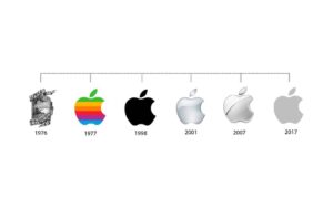
If you see a half-bitten Apple, you will likely perceive it to be Apple. Well, that’s not what Apple’s logo used to be earlier. Keeping it very simple, they have established themselves for one of the best logos in the world. It is surprising how one simple Apple can represent so much.
Earlier, the Apple logo wasn’t single-coloured but multicoloured. The previous versions of the Apple logo featured a rainbow-coloured Apple. Contrary to the previous designs, the current logo design plays a key role in branding. It is sleek and easy to remember. Undoubtedly, Apple has one of the most memorable logo designs.
McDonald’s
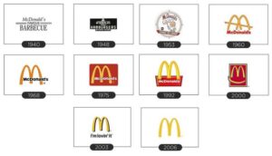
If one logo has undergone multiple changes in the past few years, it has to be McDonald’s. Since their inception in the 1940s, McDonald’s has undergone a cement identity change before it finally settled on the overarching M.
The logo design colour of McDonald’s represents the brand message and value. All the while, they were using their name in the logo. However, it wasn’t until 1983 that the brand finally decided to drop the name from their logo. Eventually, their logo became a clear part of their brand identity.
Amazon
![]()
Amazon also has a very strong branding story, especially regarding logo design. They initially started with a packed, cohesive identity but grew to become open. As one of the largest eCommerce businesses today, there is no denying that the Amazon logo is easy to memorise.
If you carefully look at the current logo of Amazon, you’ll realize that there’s an arrow connecting A and Z of Amazon. Well, their logo indicates the type of services they offer from A to Z, signifying that they’d deliver everything and anything.
Coca-Cola
![]()
If there is one logo that is widely spread and easy to recognize, it has to be Coca-Cola. Coca-Cola has kept their logo very simple. Undoubtedly, they’ve established themselves in the market as one of the most recognisable brands.
With the changing trends and inclusivity of cultural influence, the Coca-Cola logo changed too making it one of the most famous rebrands. The new Coca-Cola logo is sleek and dated. The fascinating peek lies in the fact that despite iterations, it is highly efficient. Furthermore, Coca-Cola is aware of its cultural significance, which makes it one of the timeless brands in today’s time.
Toyota
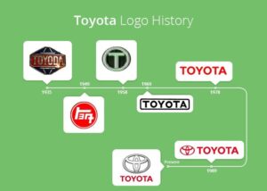
Since its inception, Toyota has undergone three variations in its logo design. Initially spelled Toyoda, this Japanese automobile company has been consistent with its logo color.
The Toyota emblem is undoubtedly one of the best logos today. The company underwent its final logo change in 1989 and has been the same since then.
BMW
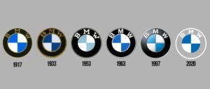
The monogram logo design of BMW is the hottest topic in the town. The initial logo design of BMW dates as far back as the 1990s. However, the current version is the one that was introduced to the market in 2020.
BMW has always maintained consistency in its brand colours of blue and grey. As the company switched into their new business era, it also changed its business logo design significantly. The current logo design of BMW provides a solid 3D visual appeal. The design team, moreover, has been very consistent in maintaining a visual balance for the logo.
Conclusion
Despite undergoing so many changes, most of these companies’ logos are still etched into the audience’s minds. As they say, a suitable logo design can impact your audience best. It is crucial that, as a business, you also follow these tips for being consistent with your logo and graphic design.
The key to being relevant to the audience is all about maintaining consistency. If you want such magic to happen with your brand, too, our experts at a Top-rated design agency in Melbourne will guide you. Well, we’re just a click away. You can reach out to us anytime to craft the perfect, timeless logos at the most affordable rates.
Articles.

April 2024
How to Design a Skateboard Graphic?
Ever gazed at a skateboard and thought, “How do they make it look so...
April 2024
Common Branding Mistakes to Avoid in 2024
Whether you’ve just launched your business or have owned one for years, one small...
April 2024
Why Is Branding Important For Business?
Picture this: You walk down a street and see two cafes on either end....