The Evolution of YouTube Logo Design

Published: December 13, 2023
The internet has become one of the most important aspects of our lives today. From the smallest to the biggest, we can find all the details online with just a click.
Like Google, we have a video search engine platform that brings most details to our fingertips. That’s none other than YouTube.
Since its inception, YouTube has undergone numerous changes, with its logo being one of those to change. At BrandVillage, we believe that their logo is a testament to how YouTube’s logo design has grown and changed. In this blog, we’ll explore the minute yet most details of YouTube logo design.
Meaning of YouTube Logo

YouTube was founded almost 18 years ago as a marketing platform for businesses. It is aimed at allowing businesses to share their products and services. With the growing popularity of YouTube, the platform eventually became a favourite choice amongst most brands. Whether it was video marketing or content creation, most brands preferred YouTube.
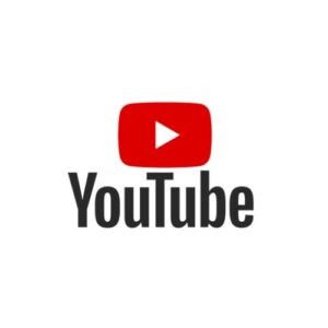
The YouTube logo is one of the most important and popular logos in the world. The older YouTube logo featured a rectangular box with a play button in the middle. It reflected the concept of video sharing. The launch of the YouTube logo was also a sign of a power shift. How? Before YouTube existed, big companies had the sole power of broadcasting.
The common public depended mainly on these big companies for broadcasting TV shows, movies or movie theatres. As YouTube emerged, there was no longer a need to depend on these broadcasting channels. With YouTube, you can ensure you have everything with you, especially visual content. A significant revolution that YouTube brought was that people could upload videos, too.
Colour and Font of YouTube Logo Design

A logo is important for businesses- especially in terms of colour and font. We closely analysed the YouTube logo design and found that it follows a unique colour and font scheme. The logo colour is its main highlight as it truly reflects the brand’s personality. The YouTube logo combines three major colours: red, white and black, each with unique codes.
Every colour of the YouTube logo stands for something important. While the red symbolises excitement and passion, the white is a symbol of harmony and purity. Since the YouTube logo brought a shift in power dynamics, the black can be considered to represent power.
The YouTube logo design further uses a customised font specially for the brand, known as the YouTube font. It is a customised sans-serif font, which is very simple. As a result, the logo design font contributes to a clean and composed feel.
How is the YouTube Logo Different from Others?
Logos that have stood the test of time and become iconic have one thing in common- they’re all unique. These timeless, unique logo designs have stood the test of time and stayed relevant amongst the audience.
Thus, specific characteristics of YouTube logo design have made it popular amongst the audience. So, what are those? Here are some of the significant logo design principles through which YouTube created its own identity in the market:
Relevance

You can only strike a chord with your audience if you are relevant. That’s exactly what YouTube did when they focused on creating a relevant logo. A relevant logo very quickly communicates the message to the audience.
YouTube stands by this principle as it reflects its brand personality through the logo. As soon as you see the logo, you’ll see the play button and realise it stands for video. Moreover, the colour combination is unique, which will impact the audience.
Memorable

A simple logo is attractive and unique- it will eventually drive the audience’s attention. If it is simple, it is memorable. YouTube’s logo is a great example of memorable logo design. The YouTube logo is one of the simplest logos you will ever come across. They can impact the audience within seconds and grab their attention.
Another factor that contributes to the memorability of the logo is its colour combination. YouTube’s logo has a unique combination of colours that makes the logo pop. As the logo pops, it becomes easier to remember.
Timeless

Aren’t logos supposed to be timeless? After all, something that can last for a long time will become easier to remember. The YouTube logo may have undergone challenges, but it has stayed timeless. They have yet to hop on the trend but kept up with the challenges.
YouTube’s logo is like an emblem that has always been here. It highlights the critical aspects of the brand. Aspiring logo designers can take logo design inspirations from the unique design of YouTube.
Conclusion
YouTube has changed the world, especially with its logo design. Their unique logo has inspired many brands to keep it simple while reflecting the business and brand models. It has dared to reshape and challenge the norms while also being unique.
Do you wish to learn more about the unique logo designs of different large businesses? Our logo designers in Melbourne will help you. As one of the leading design agencies in Melbourne, we will always bring the best and unique information related to designs. And who knows? Your mind may be blown away with such unique facts.
Articles.

July 2024
What is a Website Hosting Service?
Did you know that 88% of web users abandon sites due to poor performance? Also,...

July 2024
What is Branding in Marketing?
Branding sets a business apart, influencing: 34.6% of shoppers to repurchase 89% buy from...

July 2024
7 Commonly Used Branding Strategy
In Melbourne’s vibrant and ever-evolving market, a strong brand is no longer an option;...